Colabeans Store Design in Moscow
Location: Europe, Russia, Moscow
Client: Colabeans
Planning: 2015
Realization: 2015
Scale: 300 m2
Leading designers: LAB5 architects | Linda Erdélyi, András Dobos, Balázs Korényi, Virág Anna Gáspár
Designers: Diána Németh, Tamás Tótszabó, Dániel Palotai
Photos: Zsolt Batár
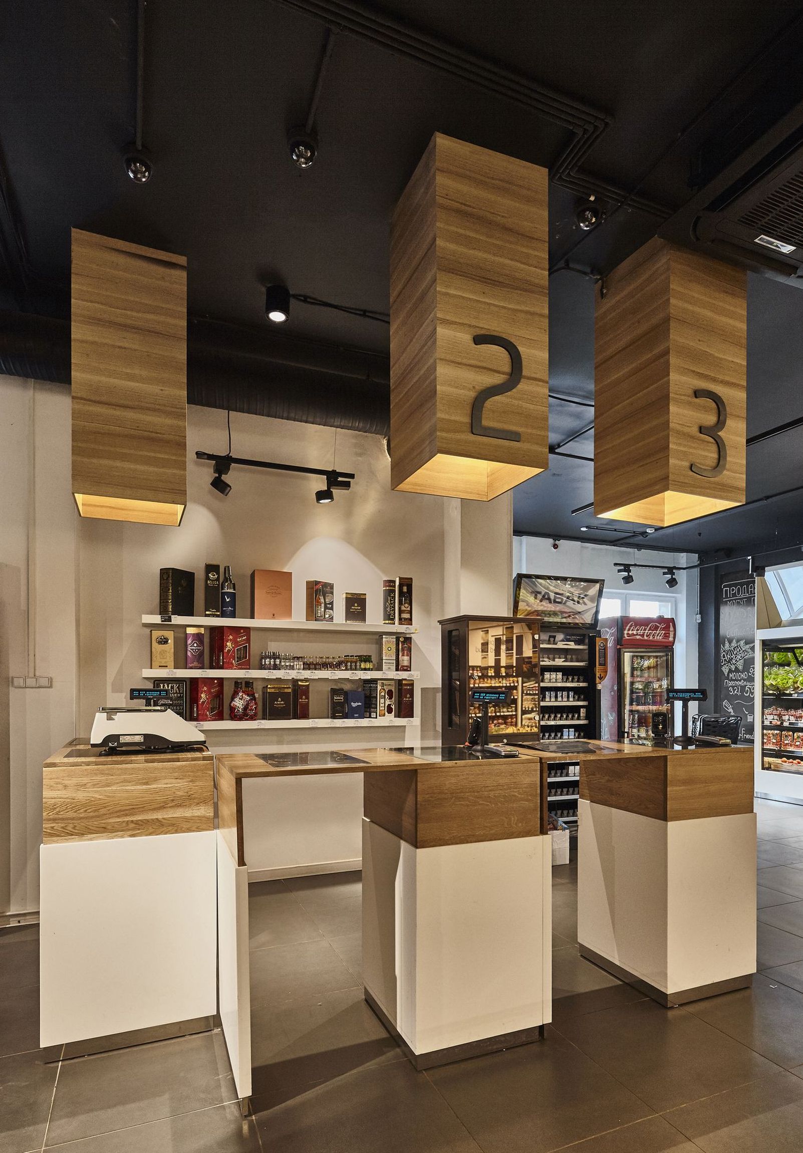
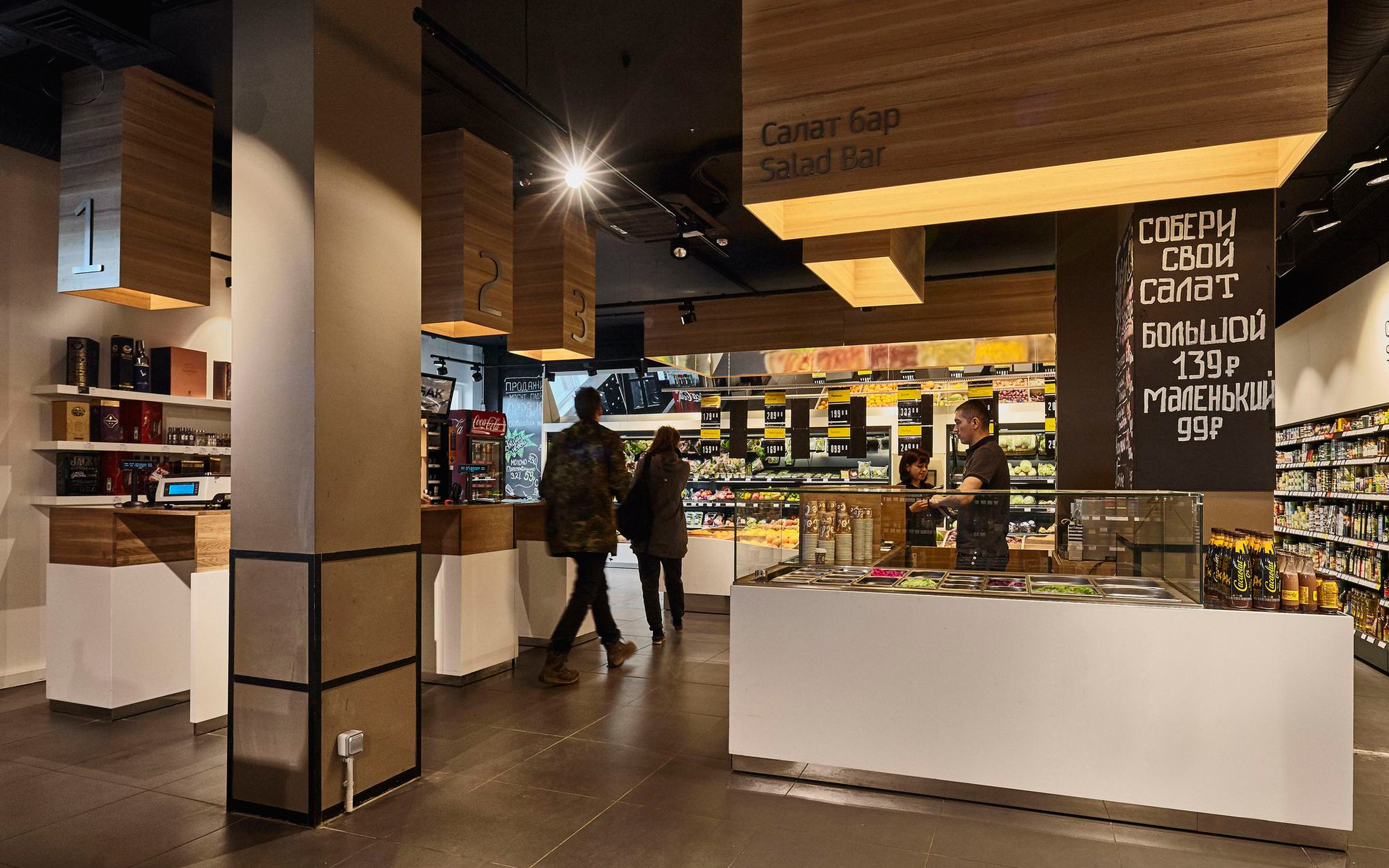
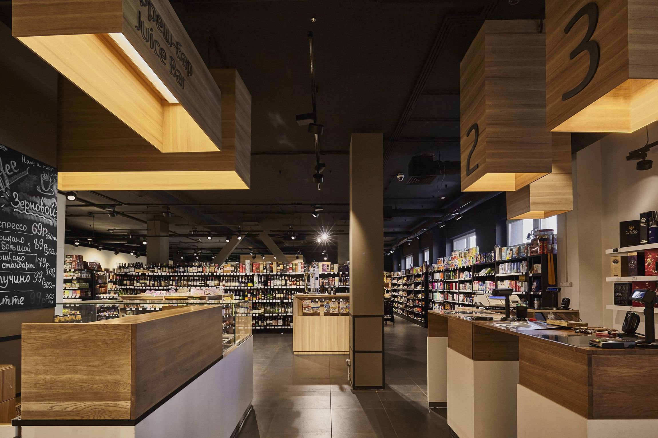
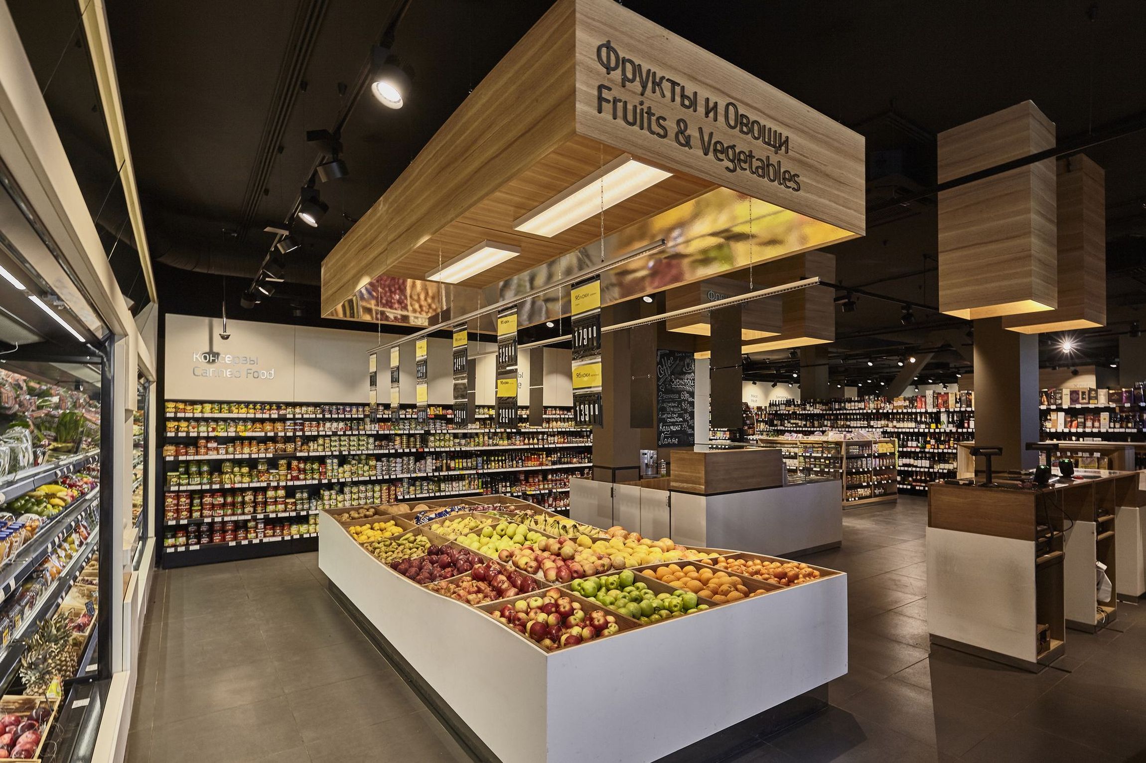
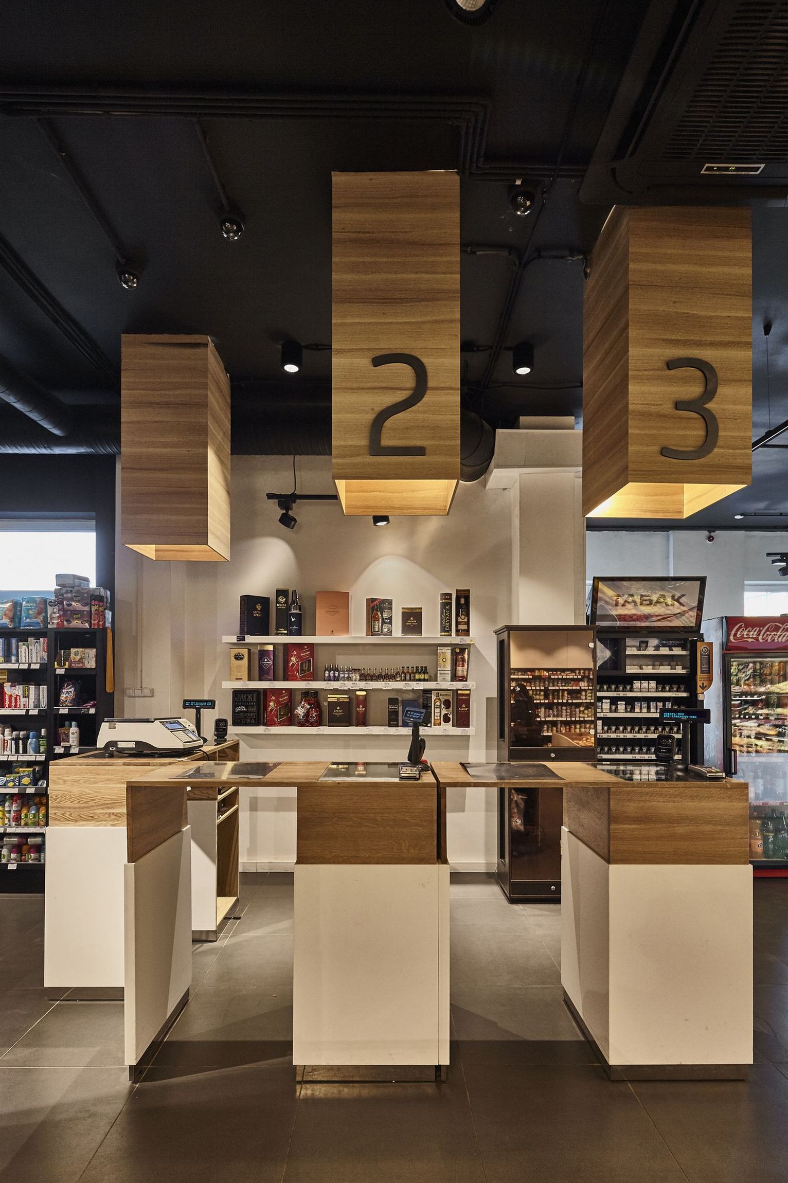
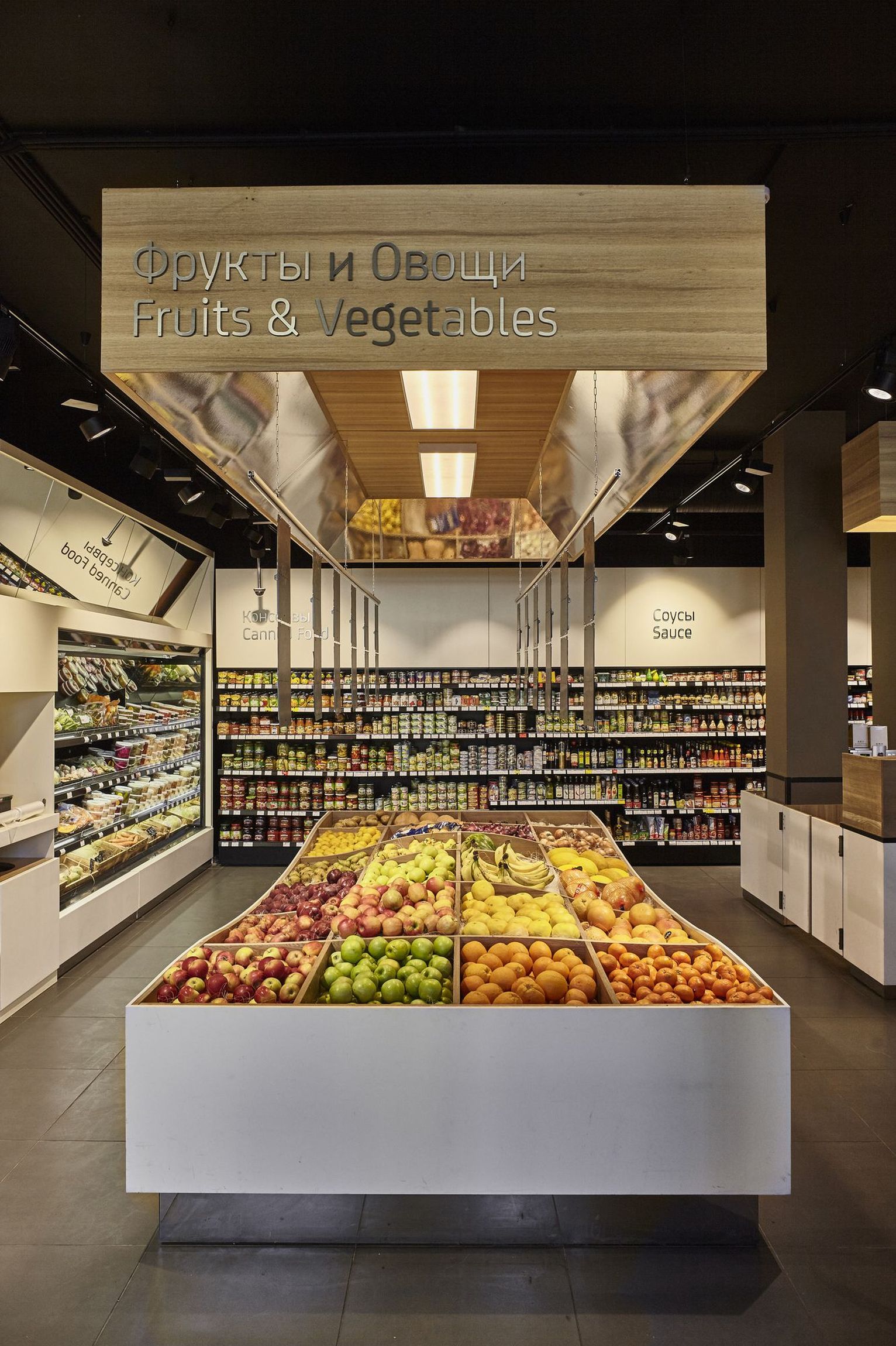
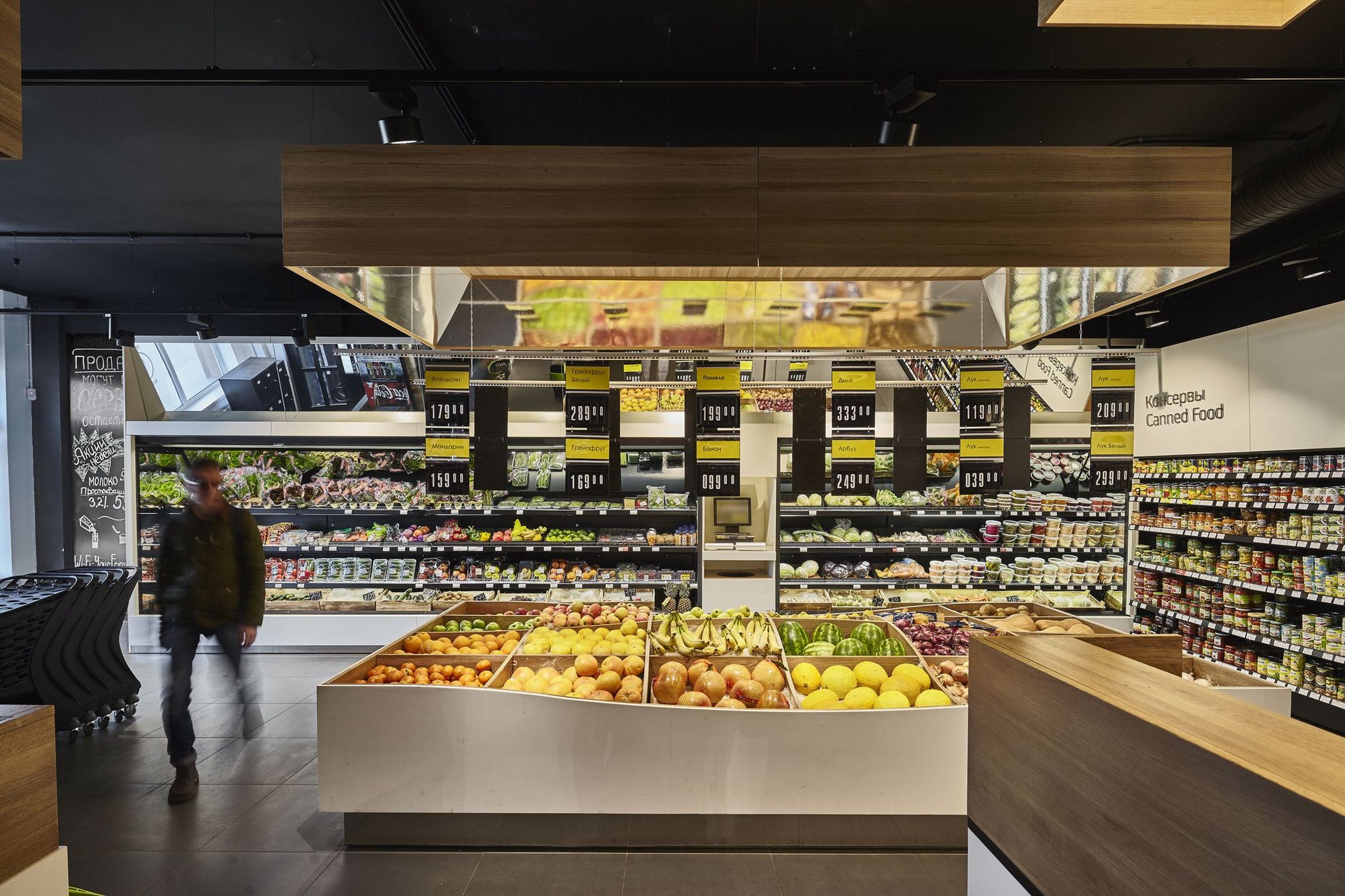
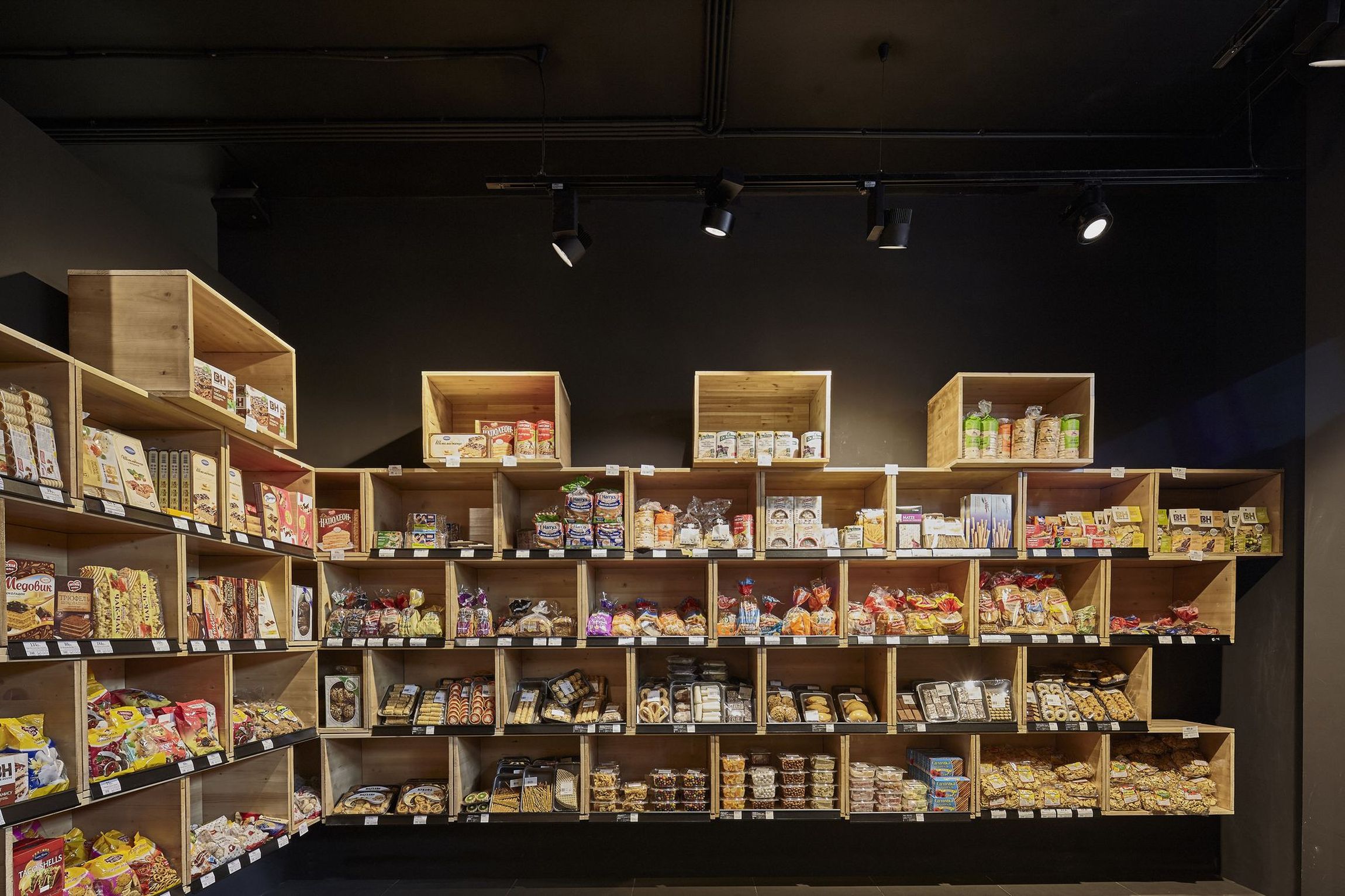
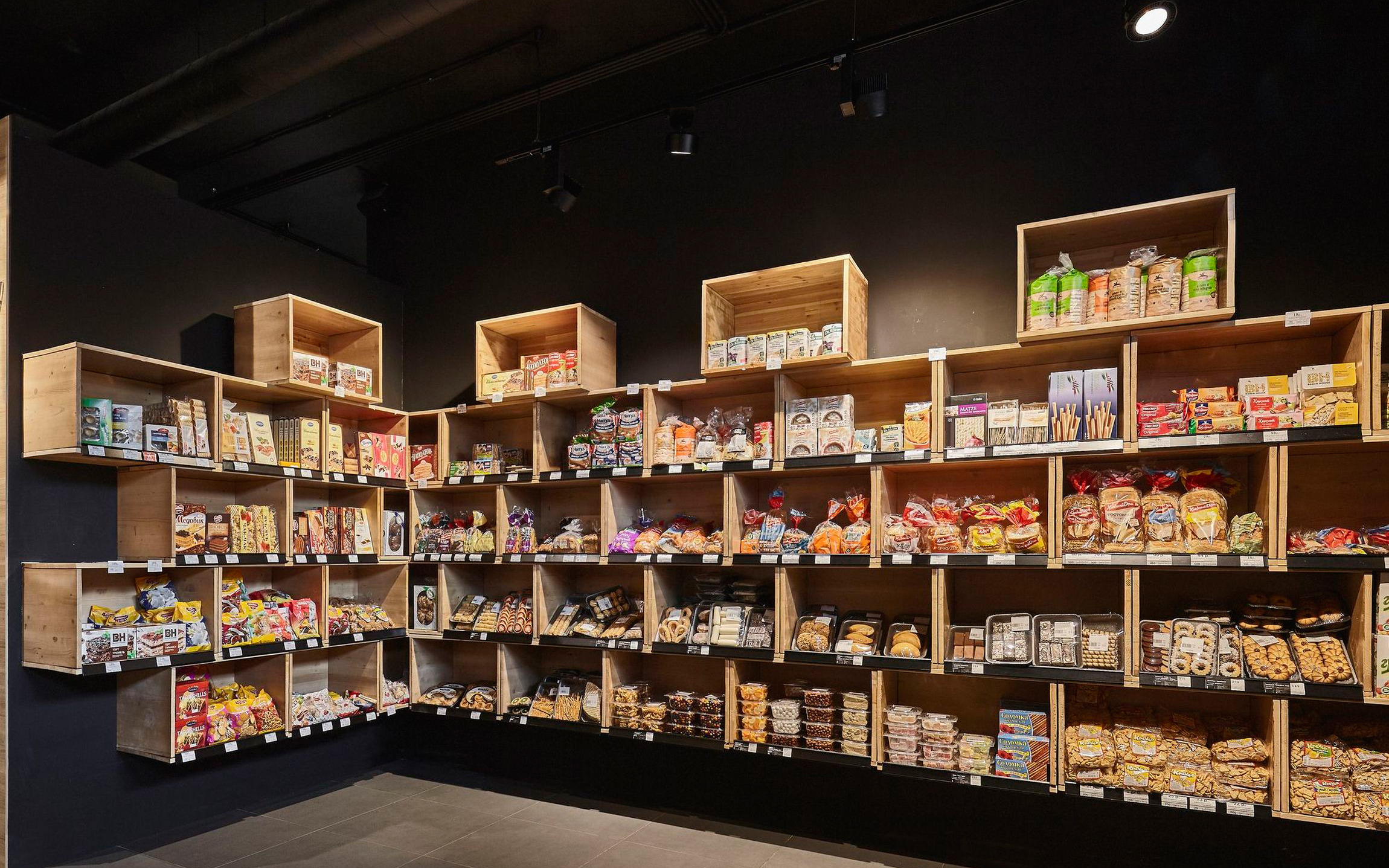
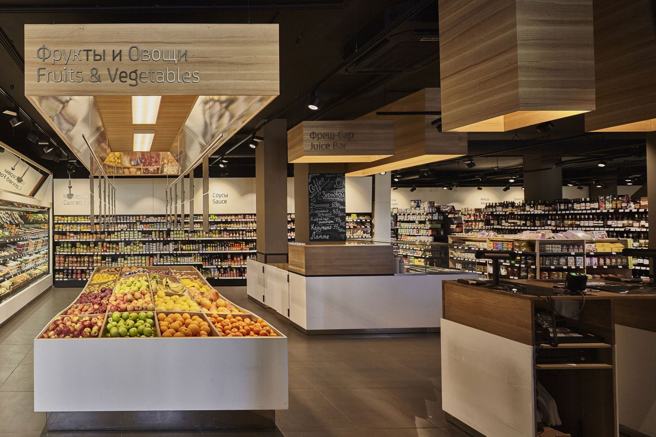
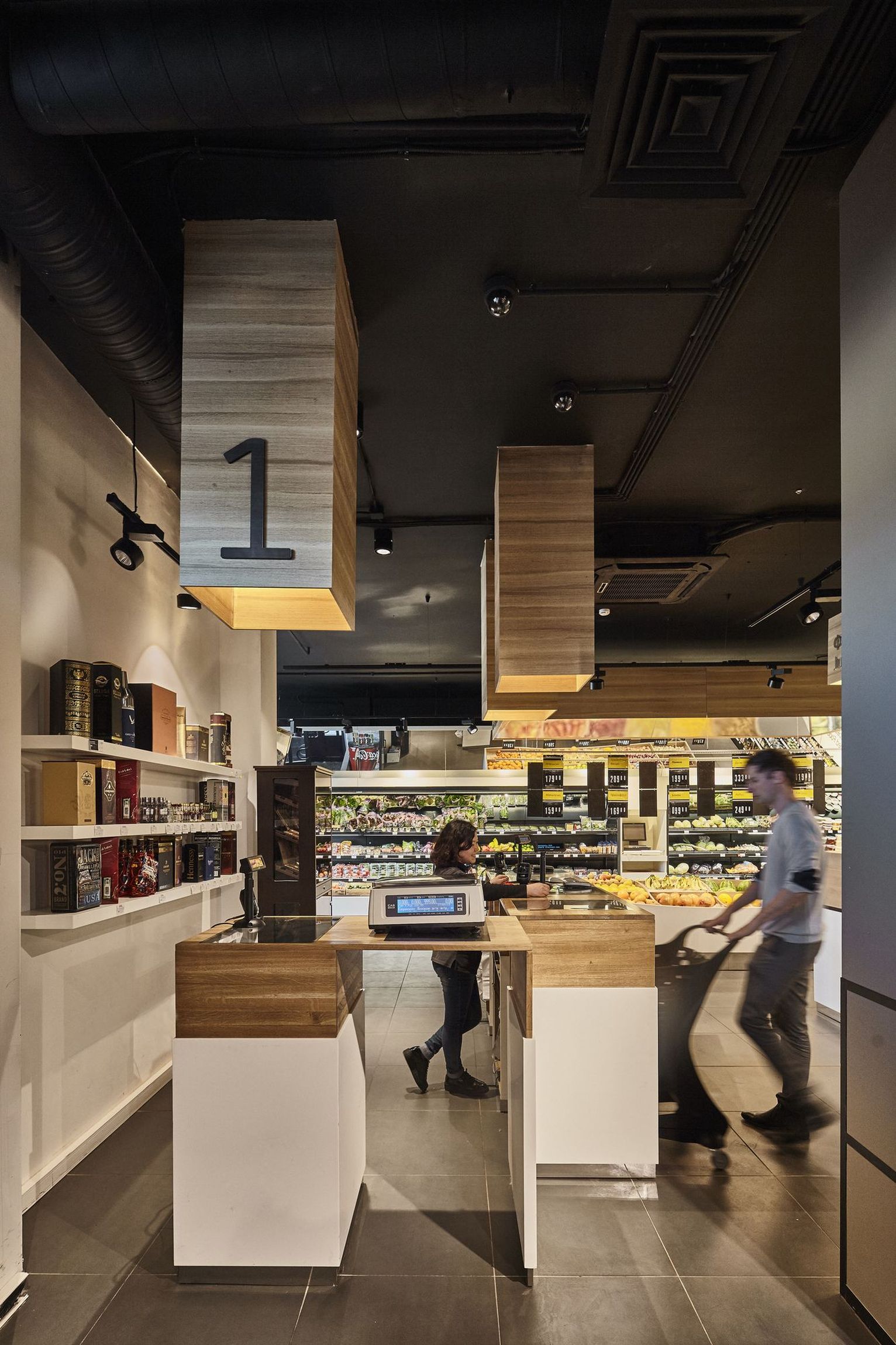
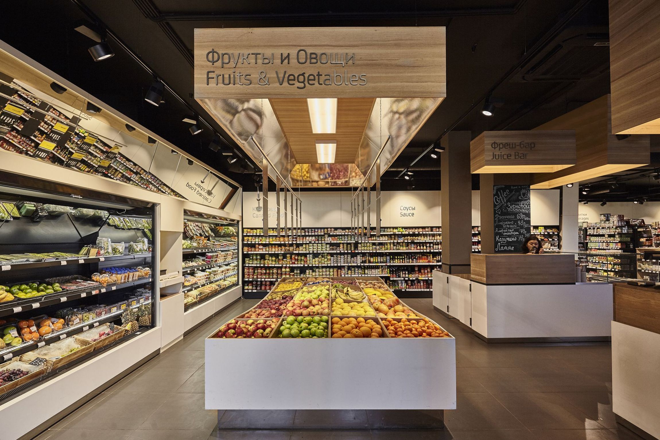
All kind of foods freshly from all exotic parts of the world – flying wooden boxes decorate the interior of the first Moscow store of Colabeans.
...Read more
History
It all started with a short e-mail from Russia.
A company of young individuals passionate about doing great things, already running the first hostel of the city, were about to venture into retail business. They came across to us via internet, and we started a long correspondence about how the new generation of a chain of Moscowian grocery stores should look like.
Most of the current supermarkets of the town are not making the customer the centre of everything. The range, quality, and pricing of products are not based on the real necessity of buyers, and the design is not following their needs and feelings.
Philosophy
One store must offer more than just good products. Going to grocery store shouldn’t be an obligatory weekday routine task, it is to be made fun, informational, and pleasant experience.
Besides selecting the right variety of products, all elements designed in the interior has to come natural and simple for the buyers, from easy orientation to comfortable picking the right goods.
Interior Design
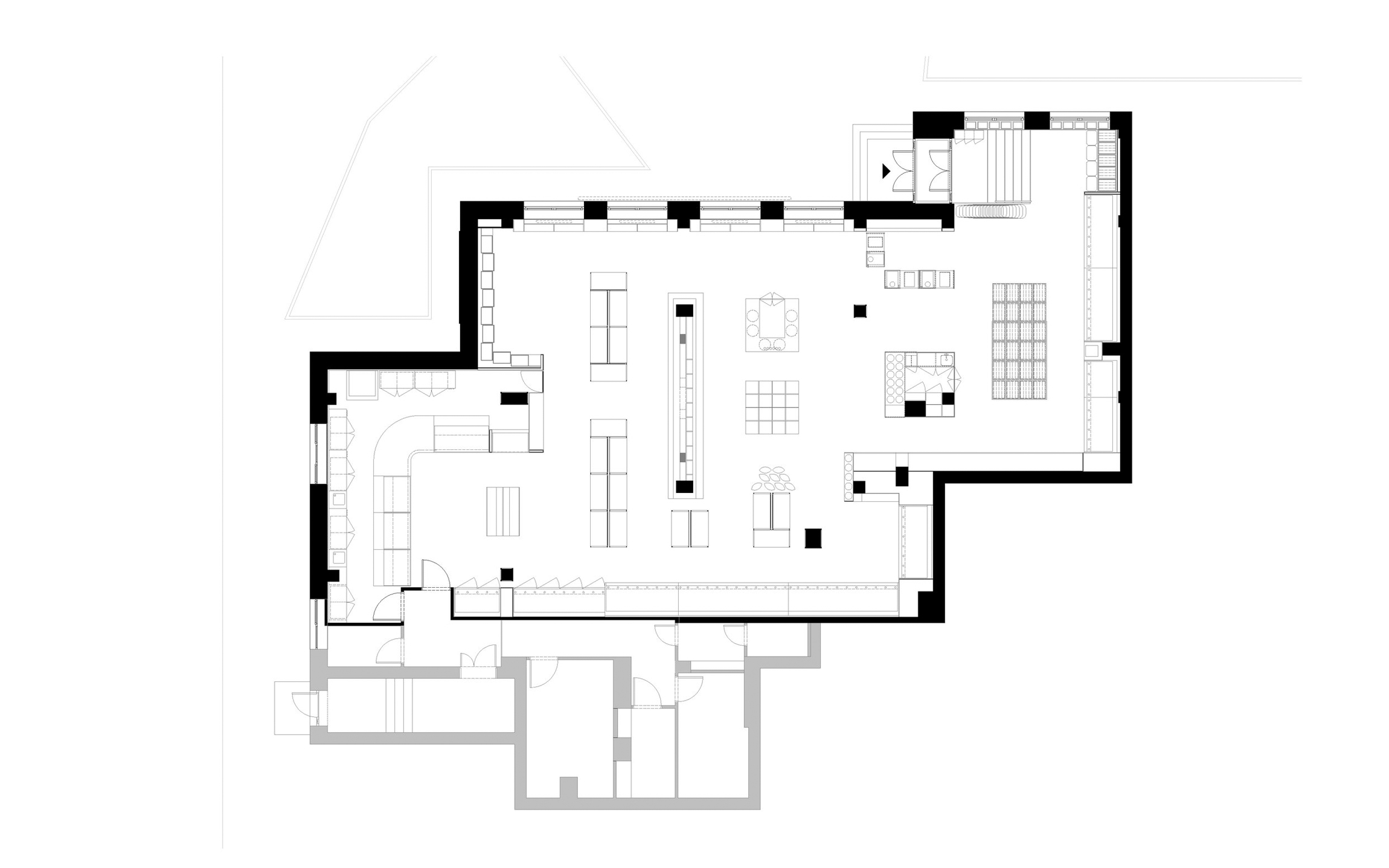
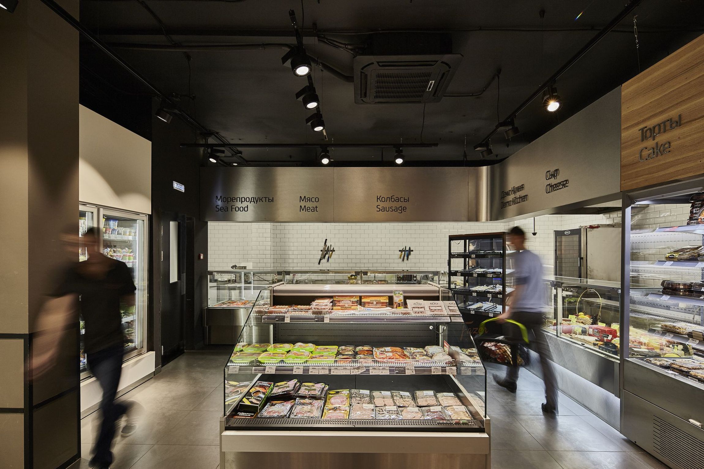
The goal was to create a space, which feels clearly organised and cosy at the same time for the customers, from the moment of stepping into the store, until packing all the paid products into their bags.
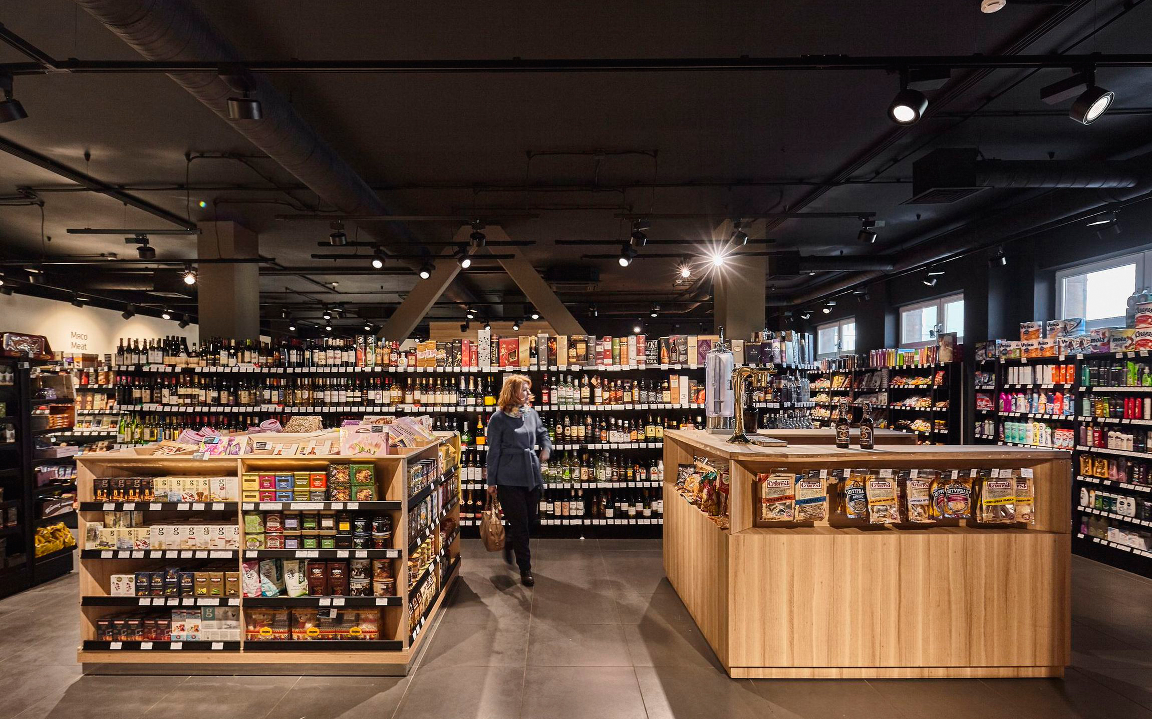
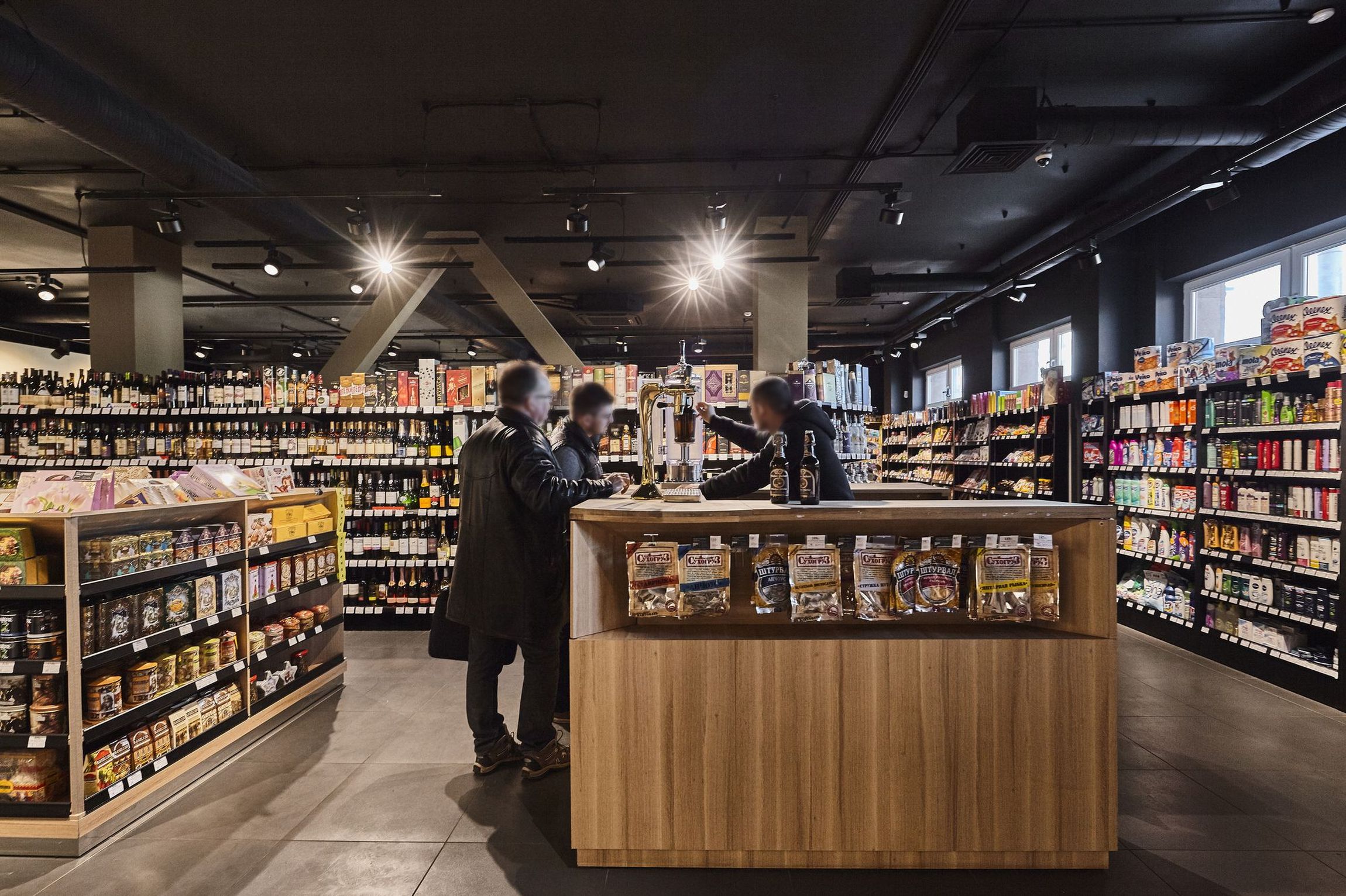
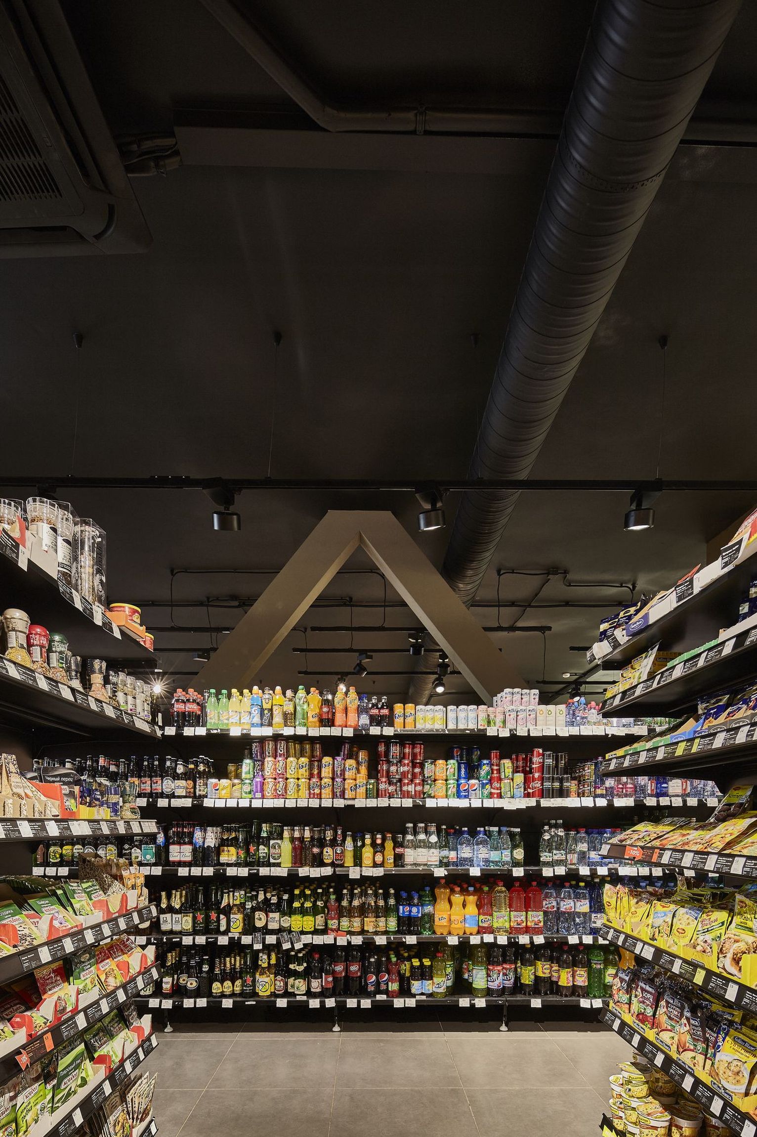
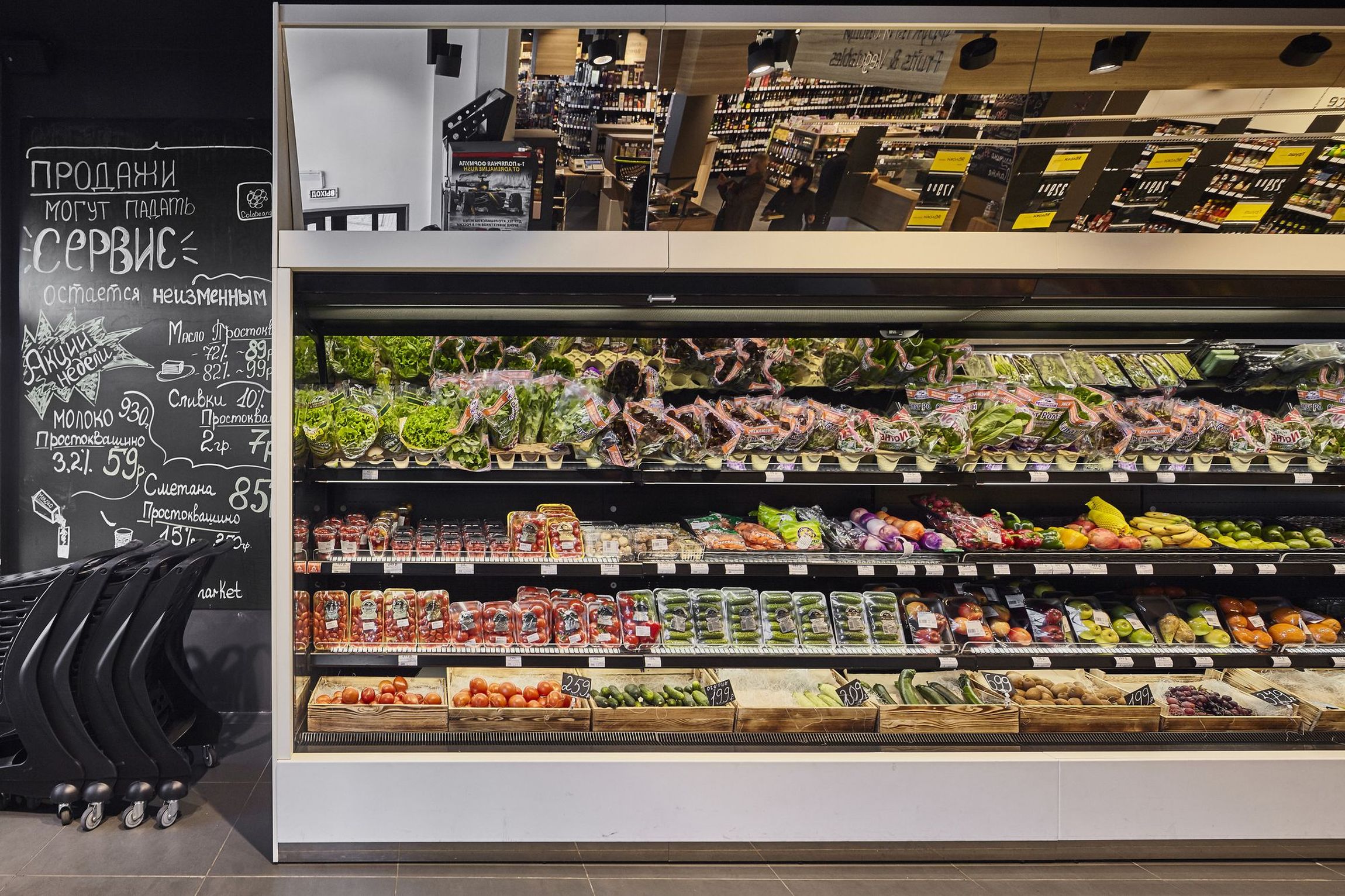
When entering the supermarket, we started with placing only low displays and elements, so that it feels spacious and convenient in the beginning. The first impression of the store comes from the fresh products. Picking the vegetables feels as natural as picking them from a hilly field. Next to the wide range of bottled products, there’s also a possibility of asking draught beer.
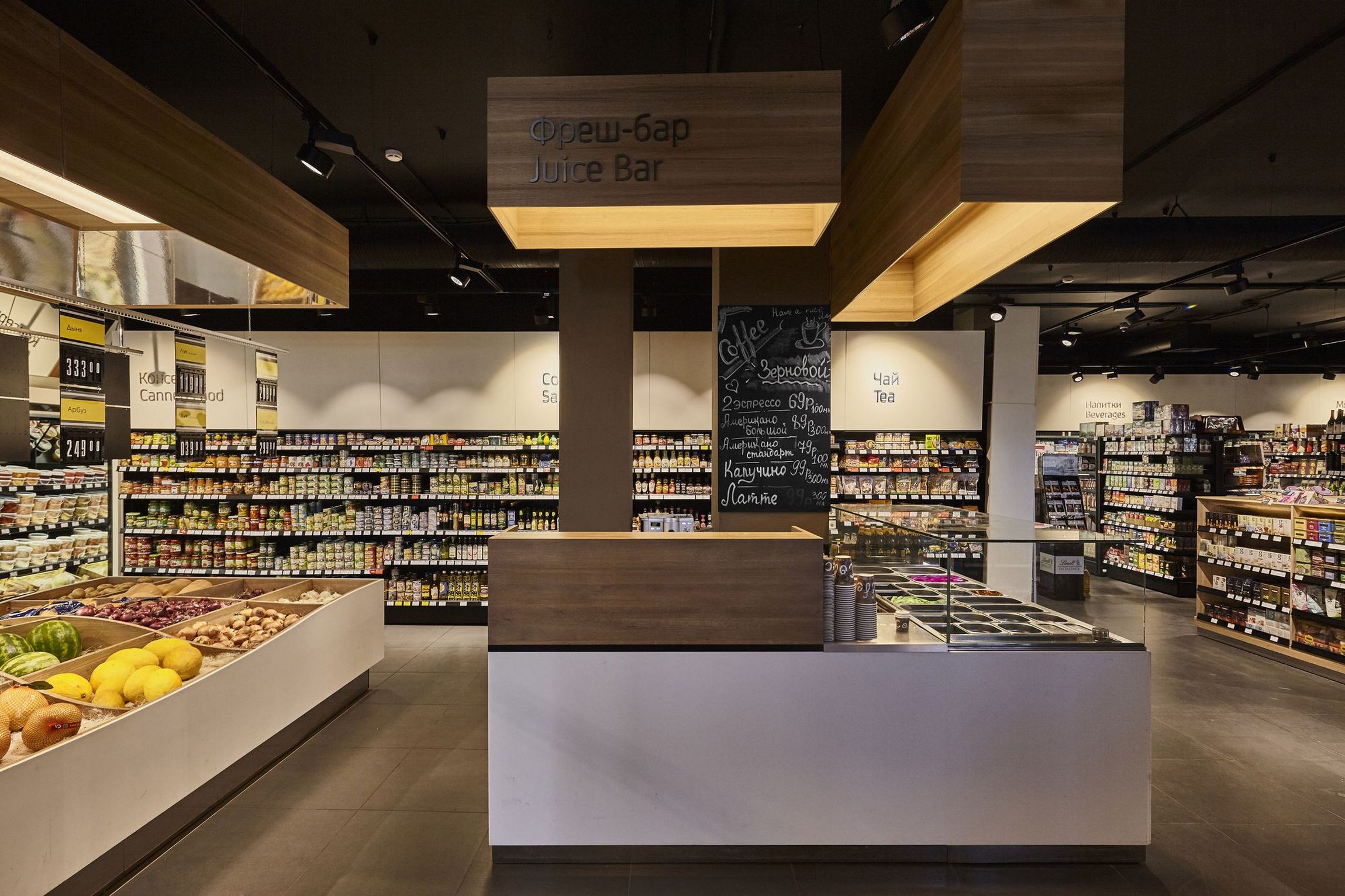
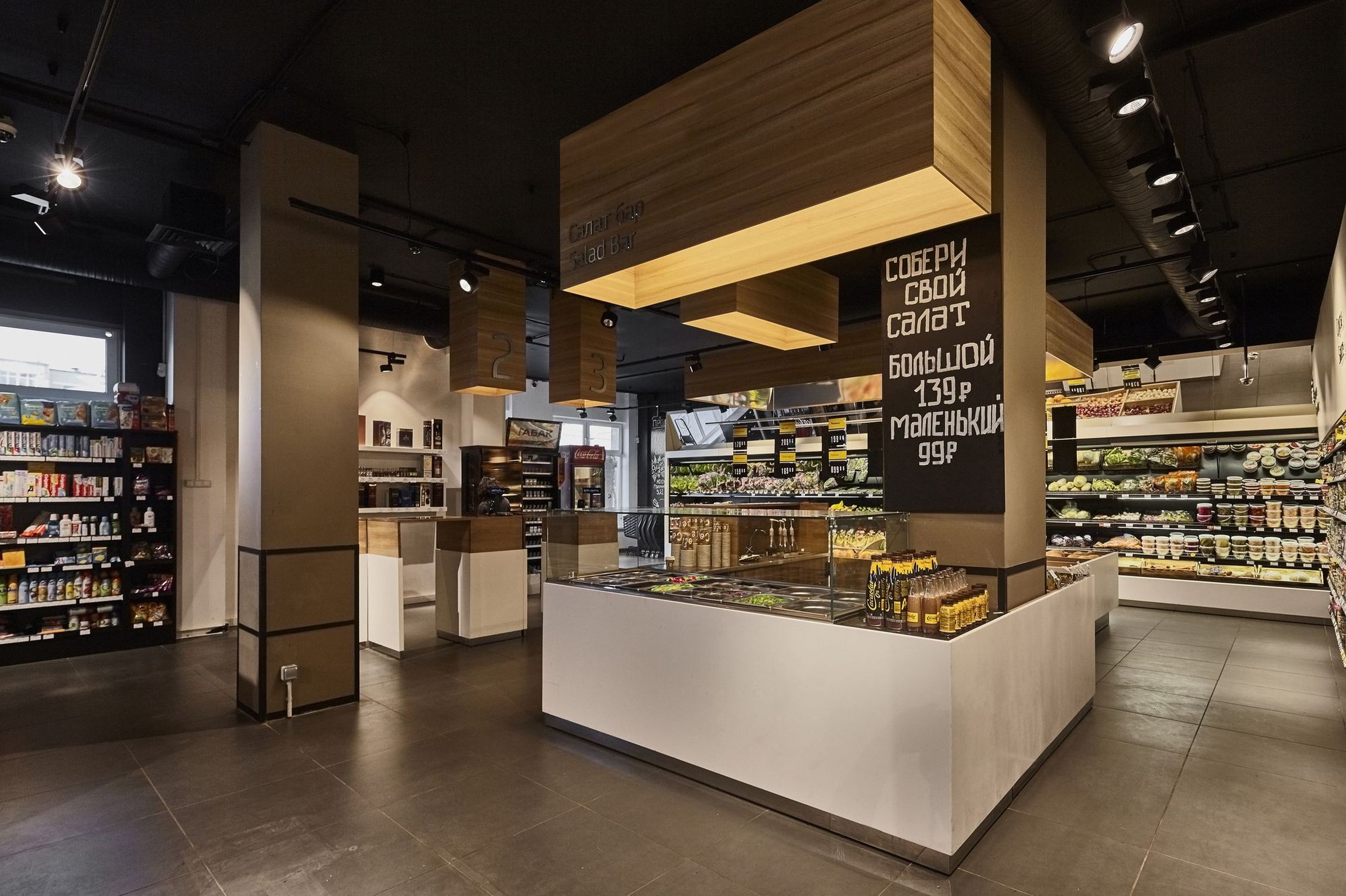
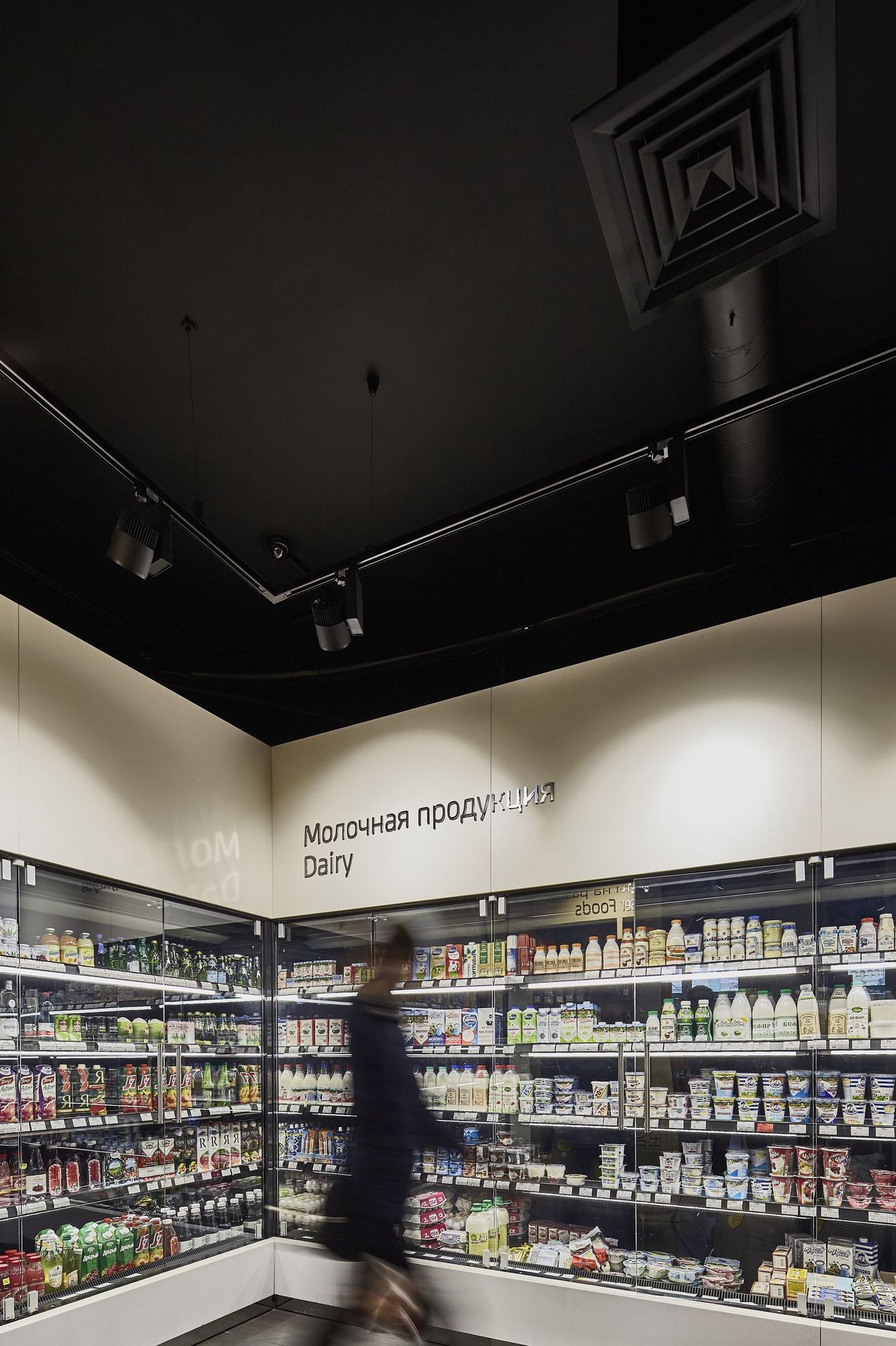
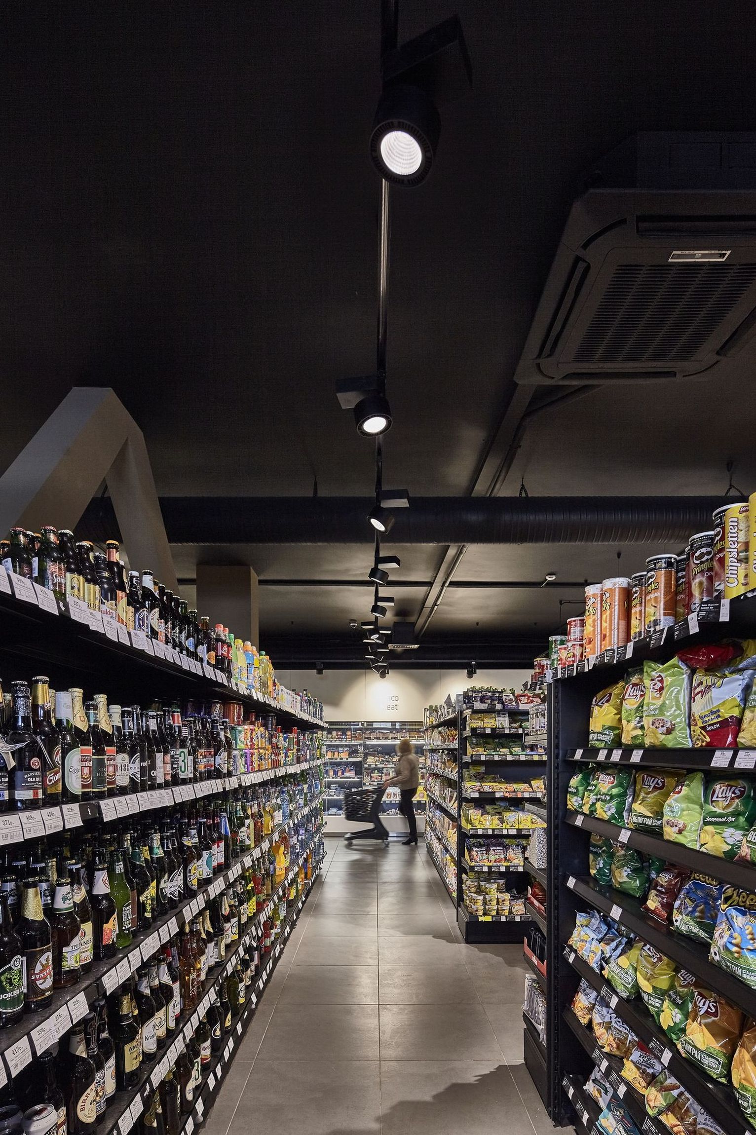
The rest of the store is geometrically organised so the orientation will be always easy. Despite the clear system of the stands and the cleanness we were about to display, we wanted to achieve a cosy atmosphere, so we applied wood on many of the visible surfaces. To avoid a too sterile feel, we used dark colours for the metal stands, and to provide durability, we used hard surface corian on parts that could be the easiest to hit by the supermarket trolley.
A special solution makes the final act of shopping to be very comfortable. The trolley can be pulled across the counter by the cashier, so while arranging the payment, another shop assistant can deal with the packing, and so the costumer doesn’t have to deal with it, can leave faster.

