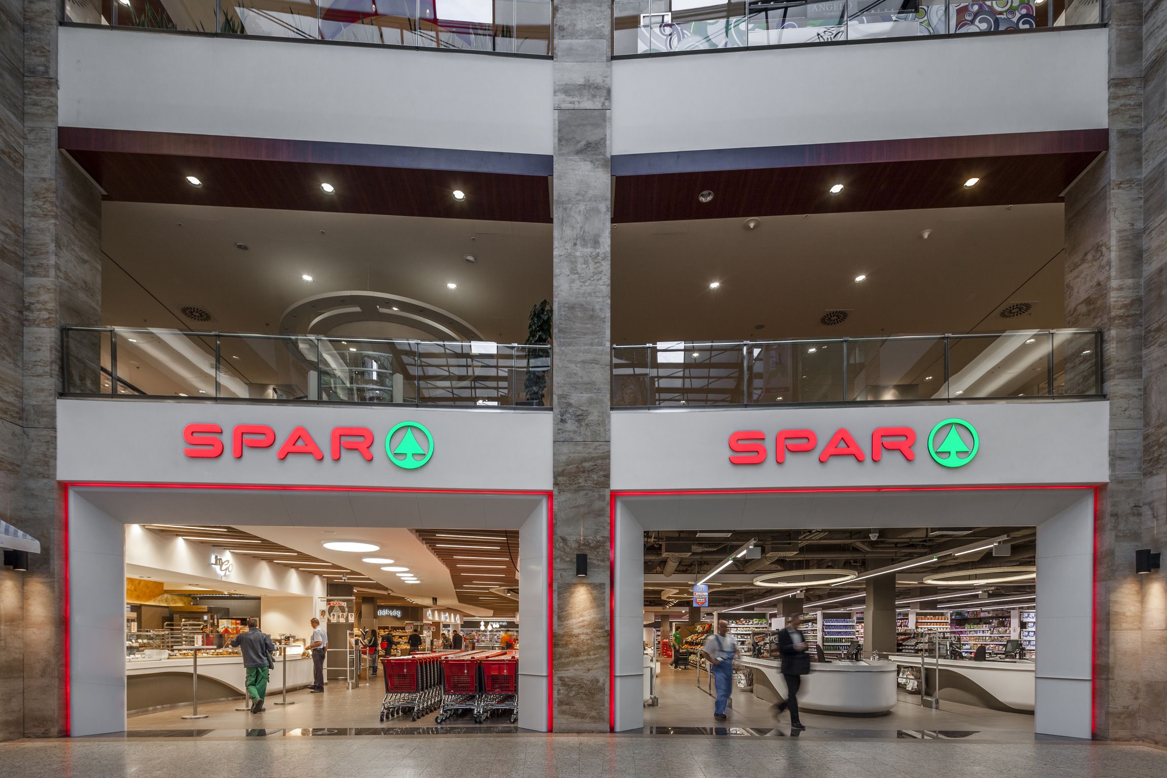
Location: Hungary, 1123 Budapest, Alkotás utca 53. MOM Park
Client: SPAR Magyarország Kereskedelmi Kft.
Planning: 2013
Realization: 2013 june-september
Scale: 2000 m2
Leading designers (architecture and interior): LAB5 architects | Linda Erdélyi, András Dobos, Balázs Korényi, Virág Anna Gáspár
Designers: András Debreczeni, Zoltán Szegedi, Tamás Tótszabó, Zoltán Vámos
Photos: Zsolt Batár
SPAR decided to open its new supermarket at a shopping mall called MOM Park, situated in the heart of a wealthy district of Budapest. They had the idea of building up a unique interior, which provides a high quality costumer experience. To choose the designer of this flagship store, they invited architects and interior designers to take part in a non-open competition, and submit sketches of ideas. LAB5 architects won because of the look and feel of a market space, with a friendly industrial atmosphere.
...Read more
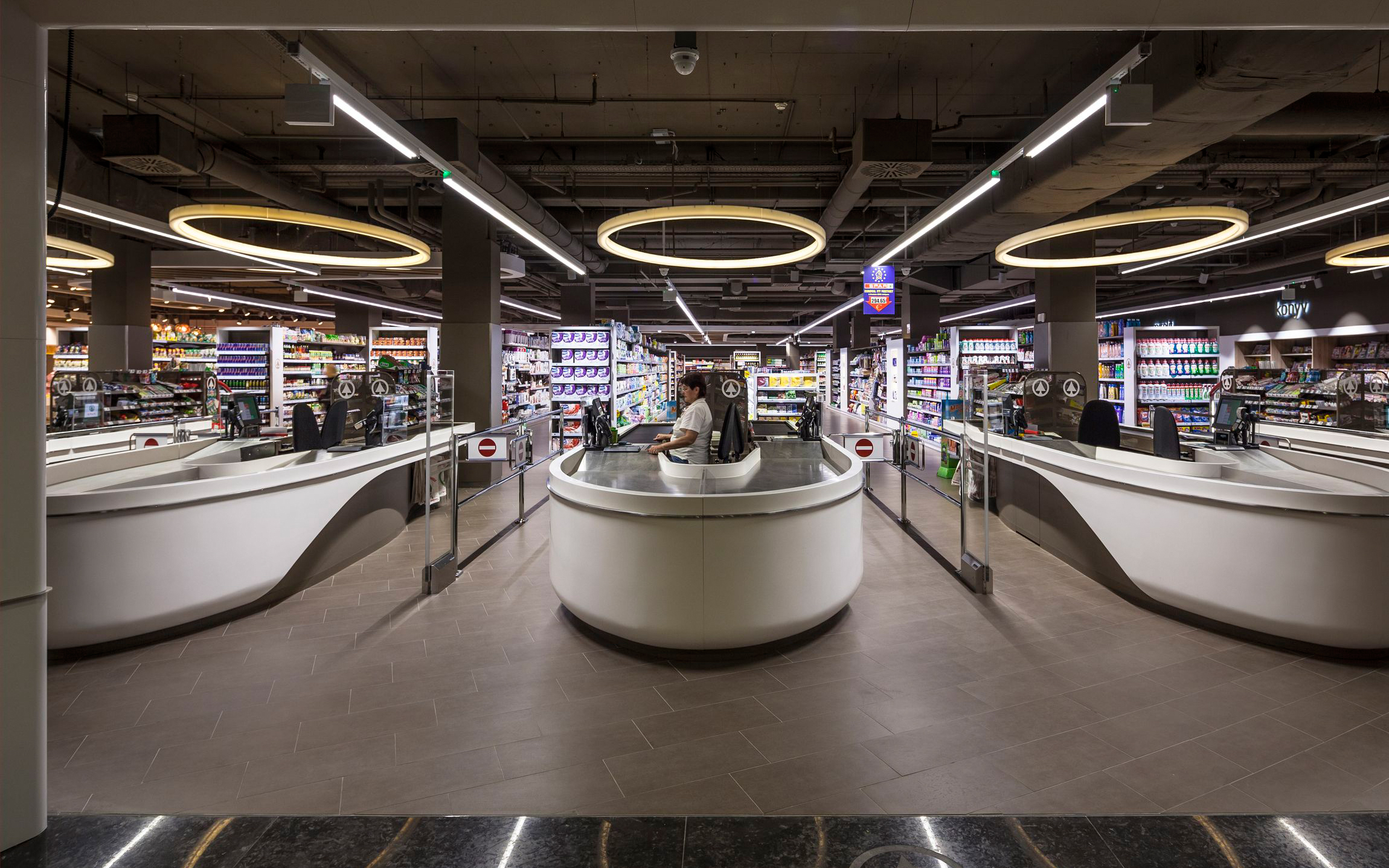
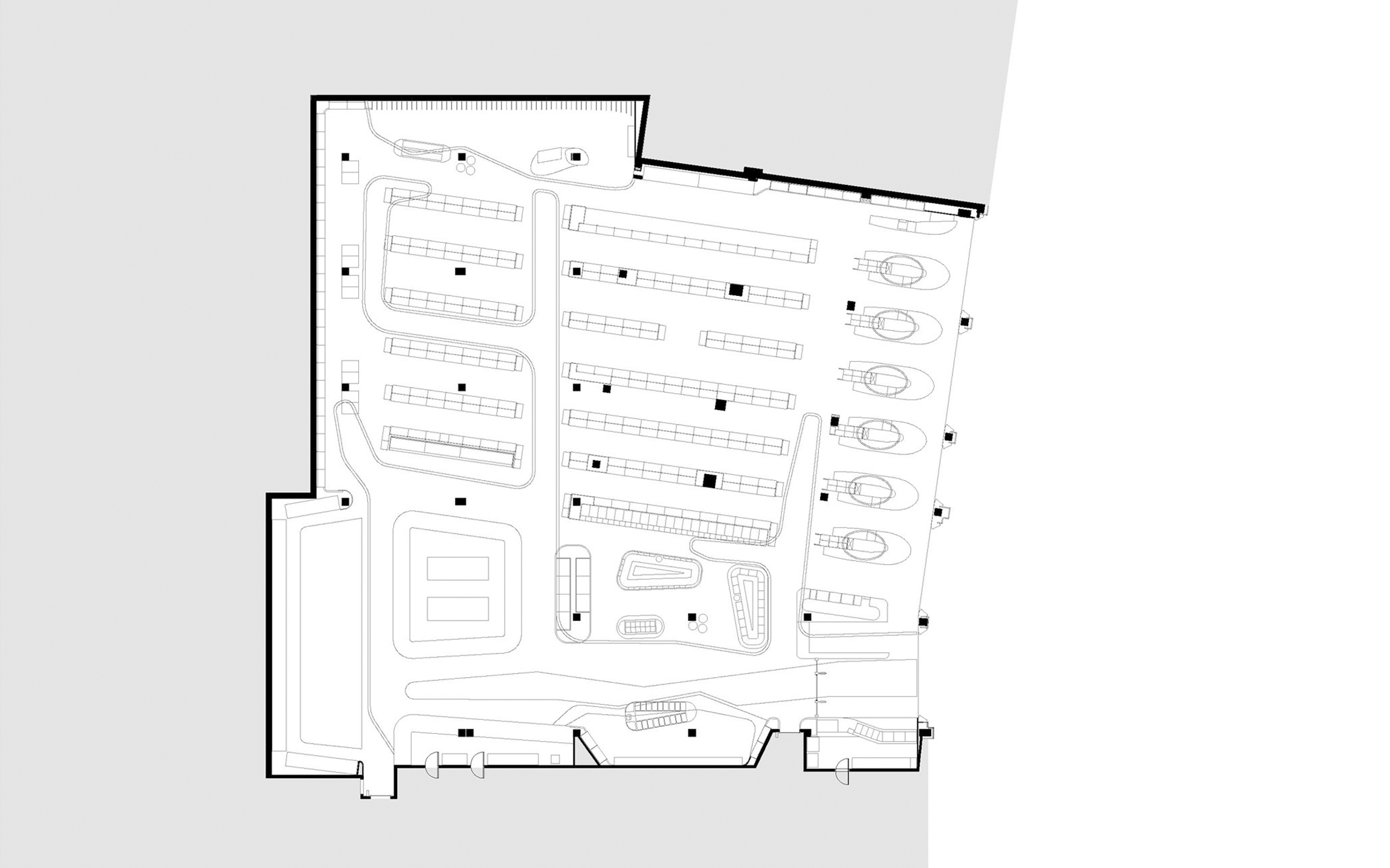
This retail draws mainly three kinds of costumers, so the layout is organised accordingly. One can be shopping very quickly even not entering across the gates, which is very convenient for example for the people running to the movie theatre. There is a "short route" for quick daily shopping, and a "long route" for weekend buyers.
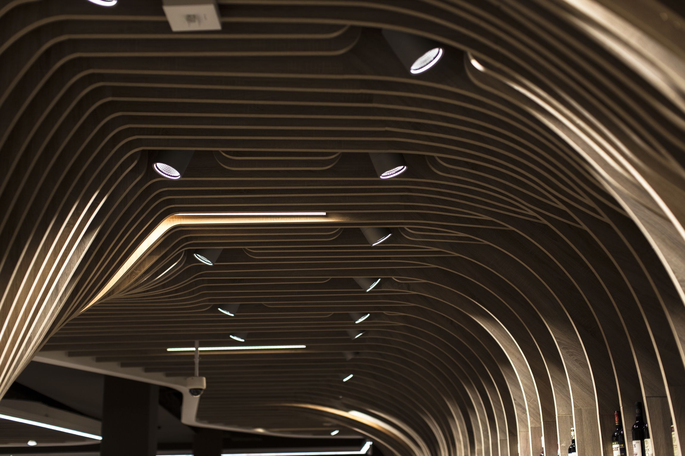
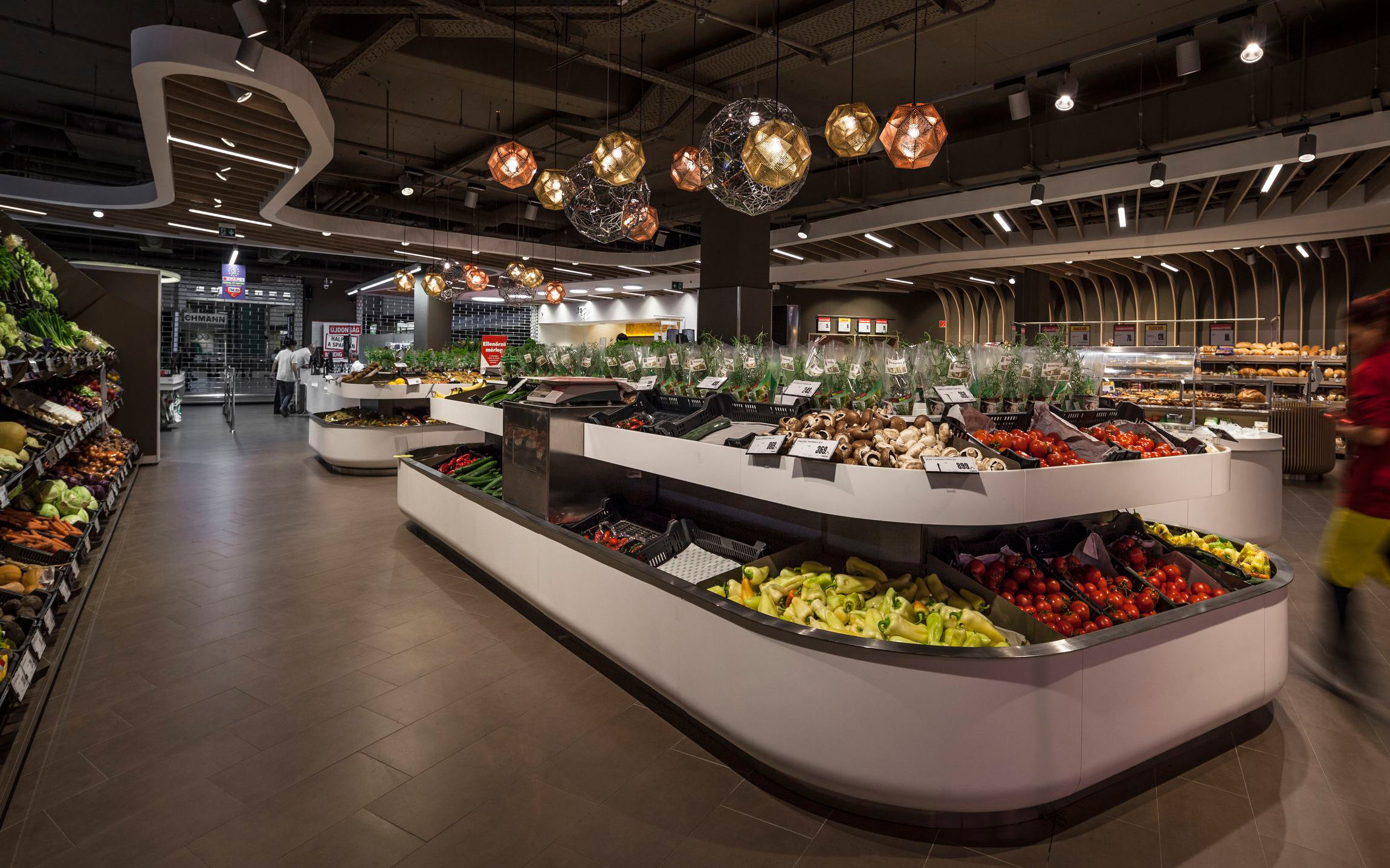
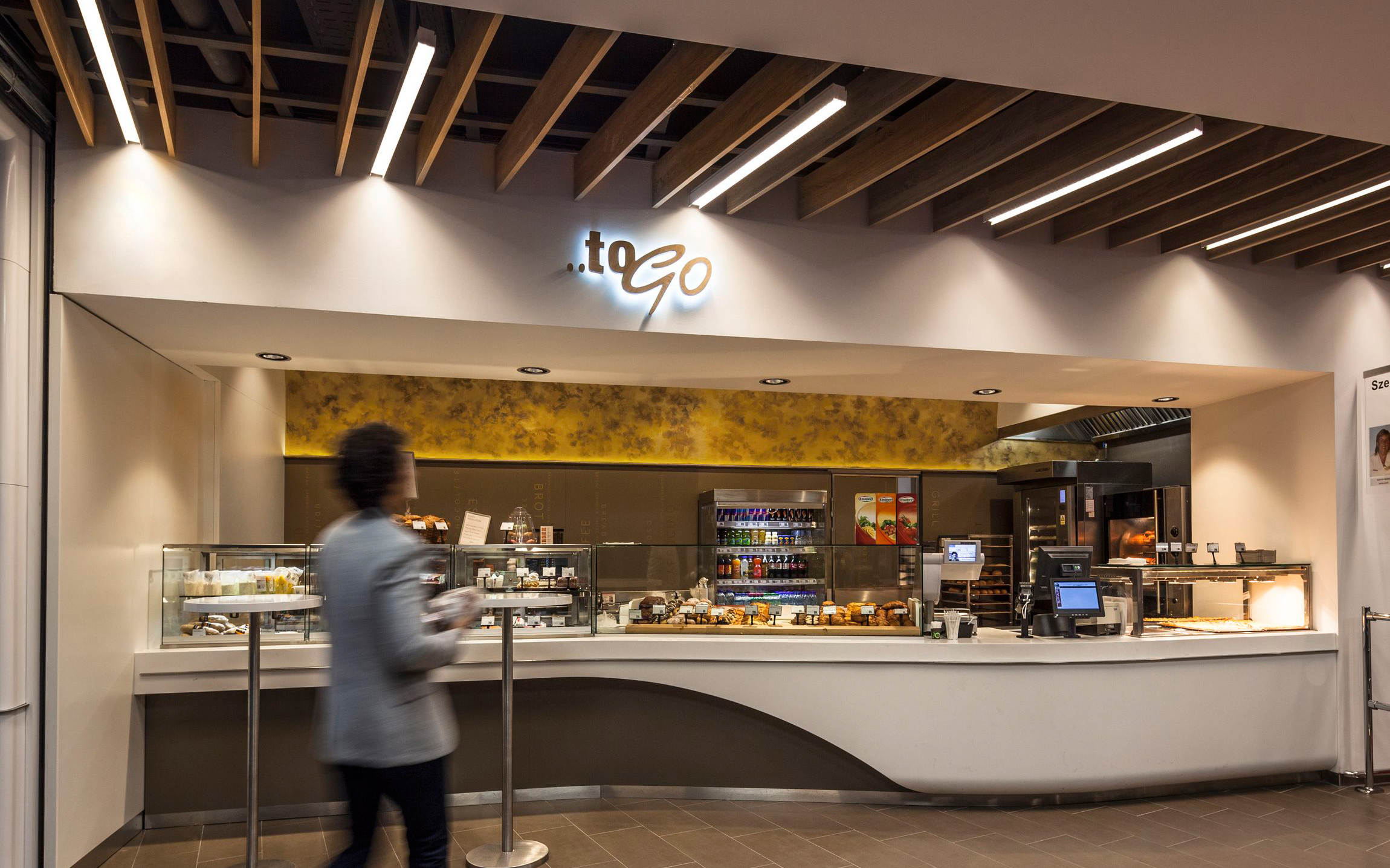
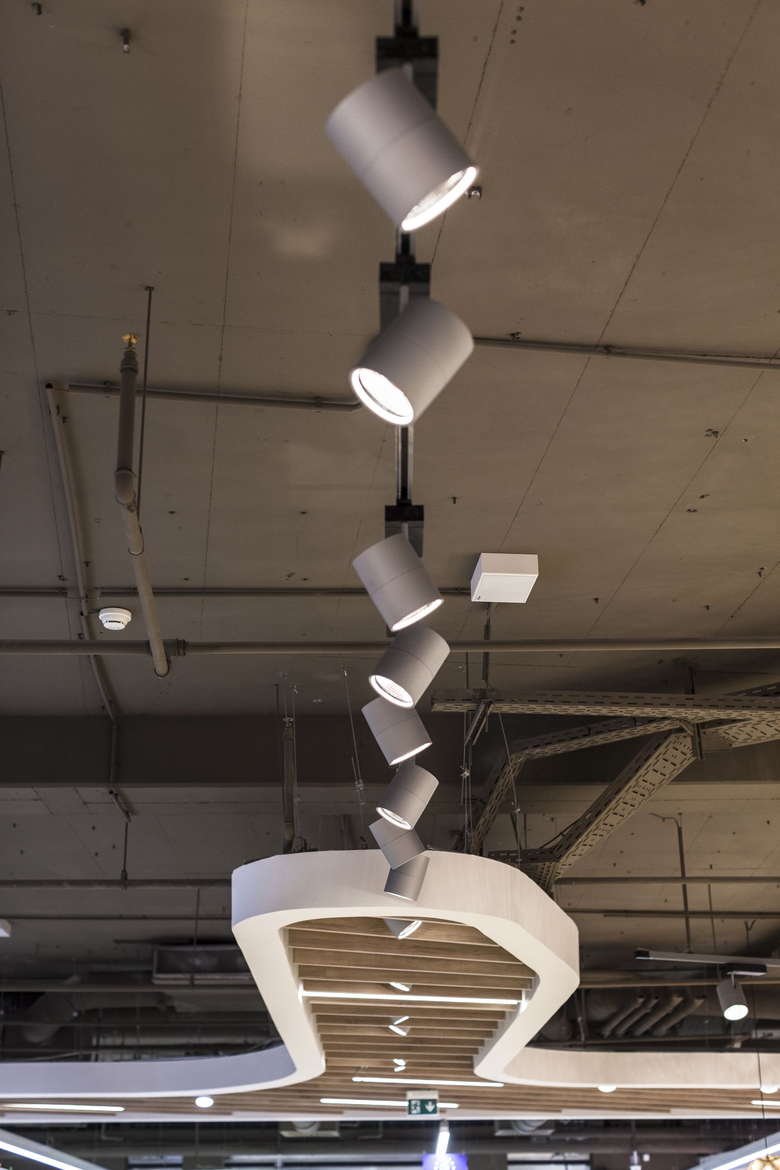
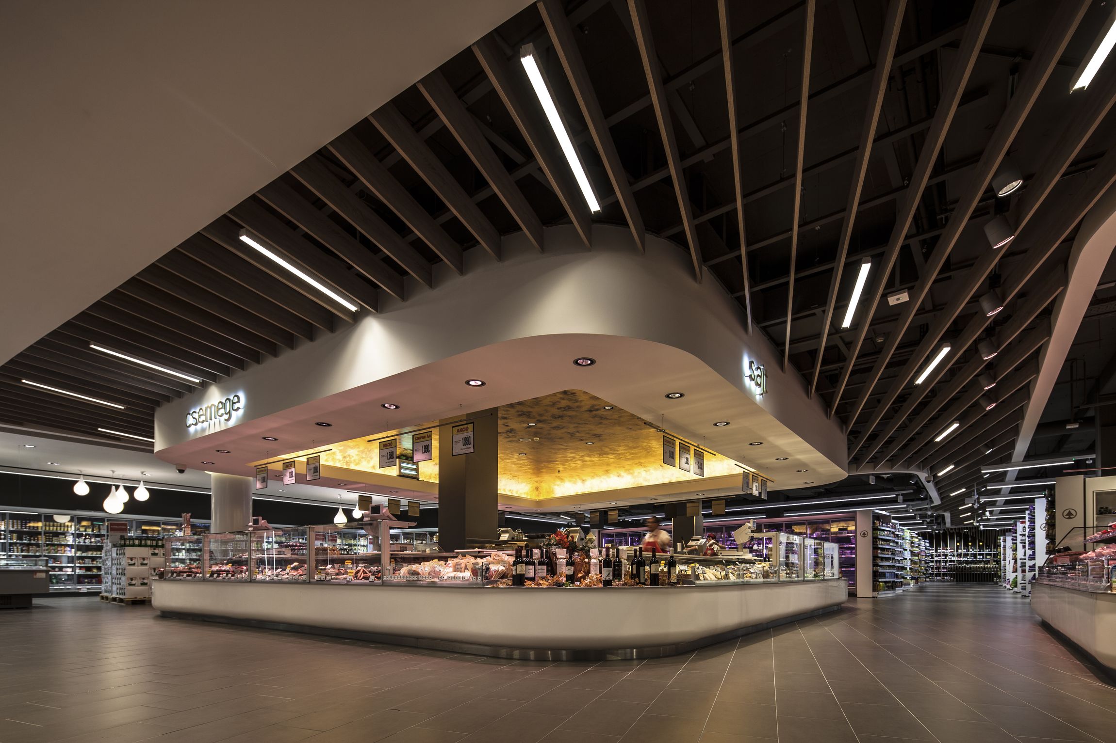
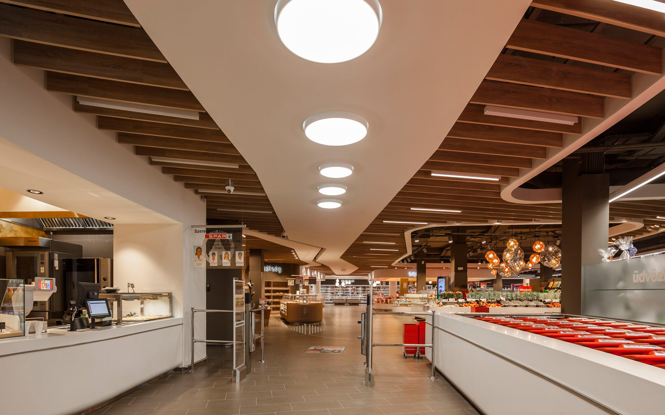
Shapes, and the ceiling
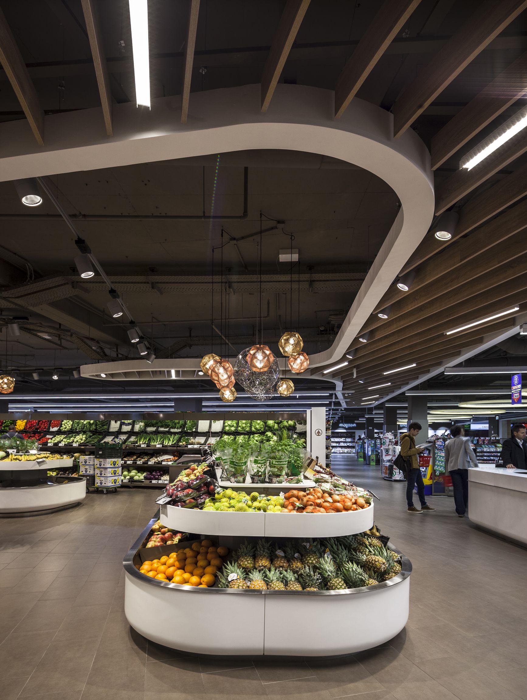
All the forms in the interior are inspired by the flow of costumers.
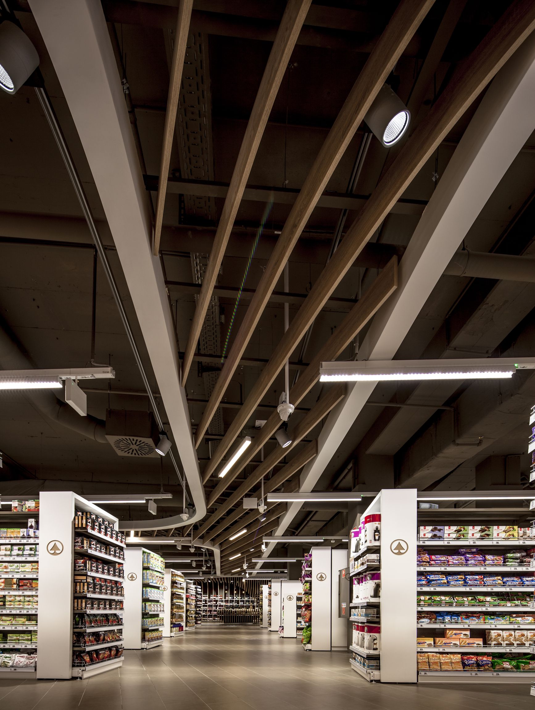
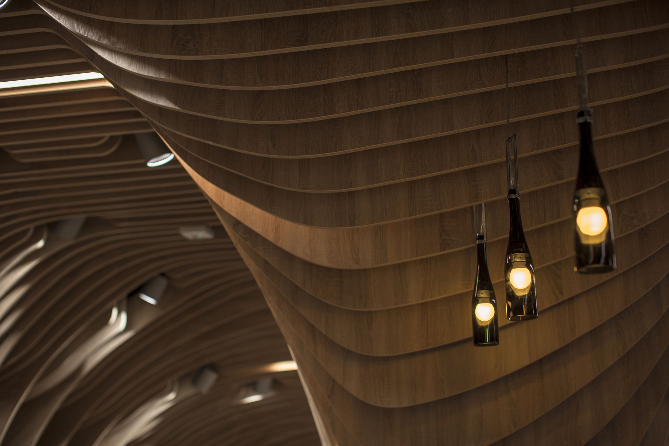
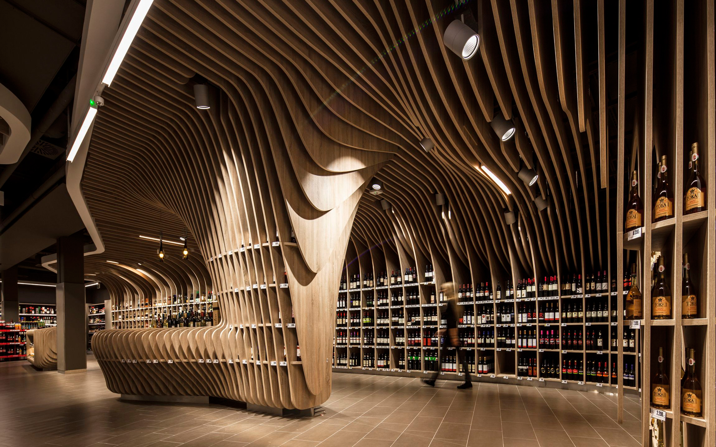
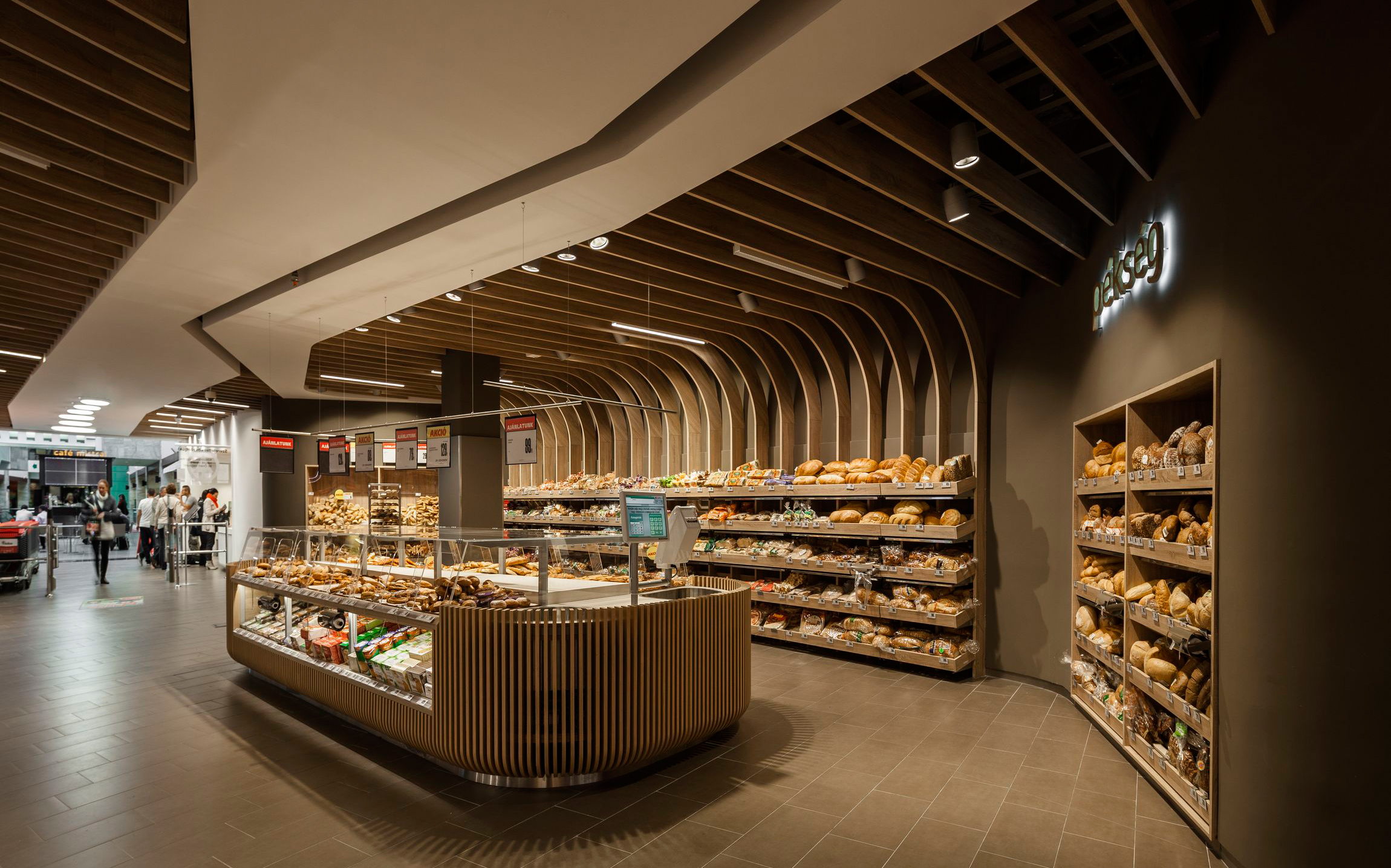
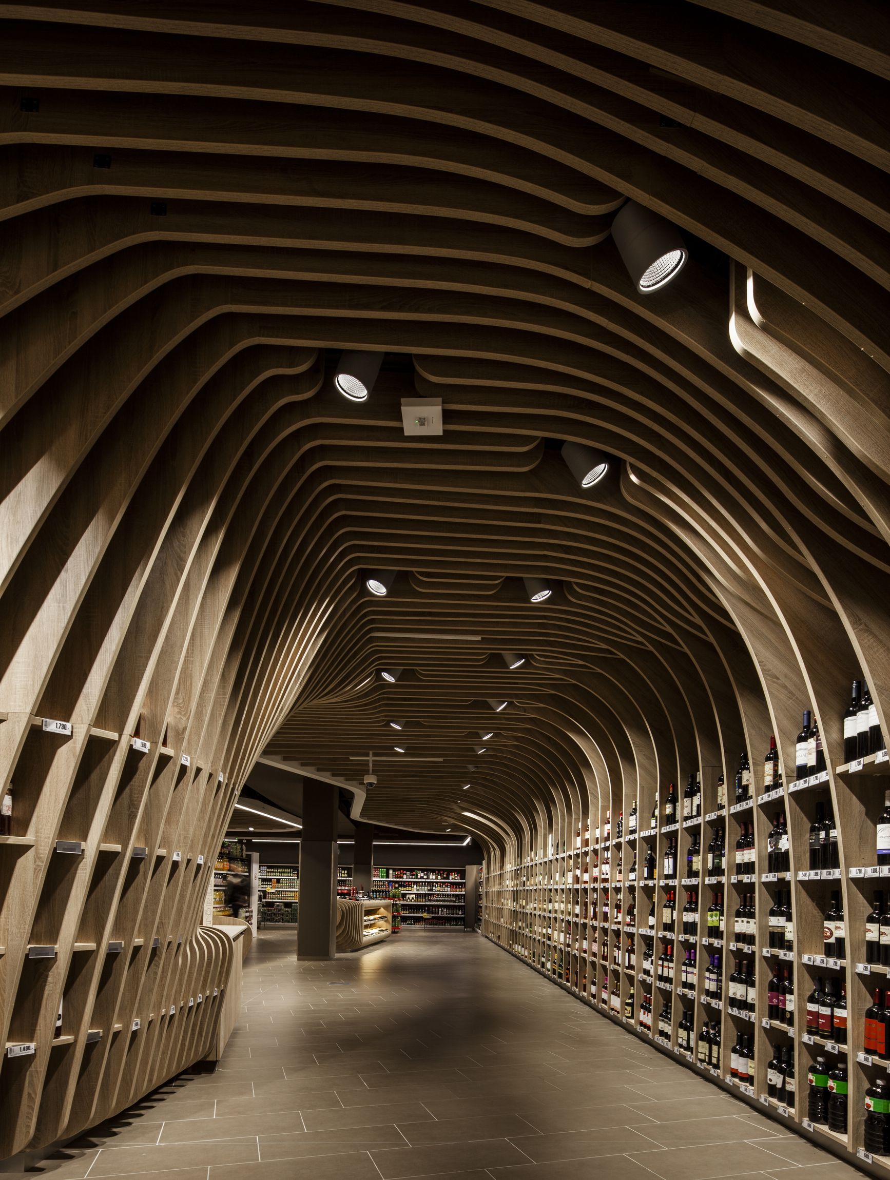
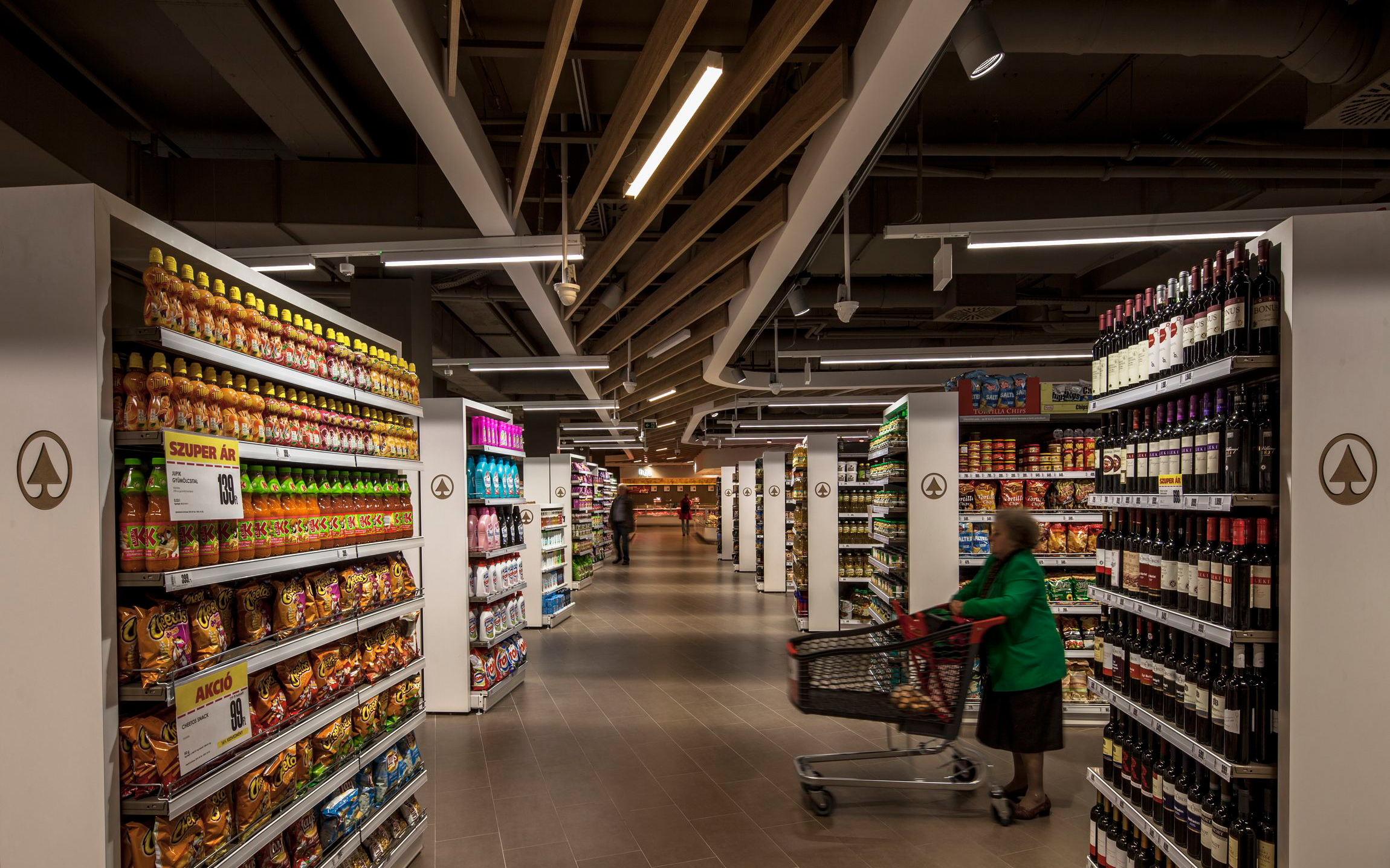
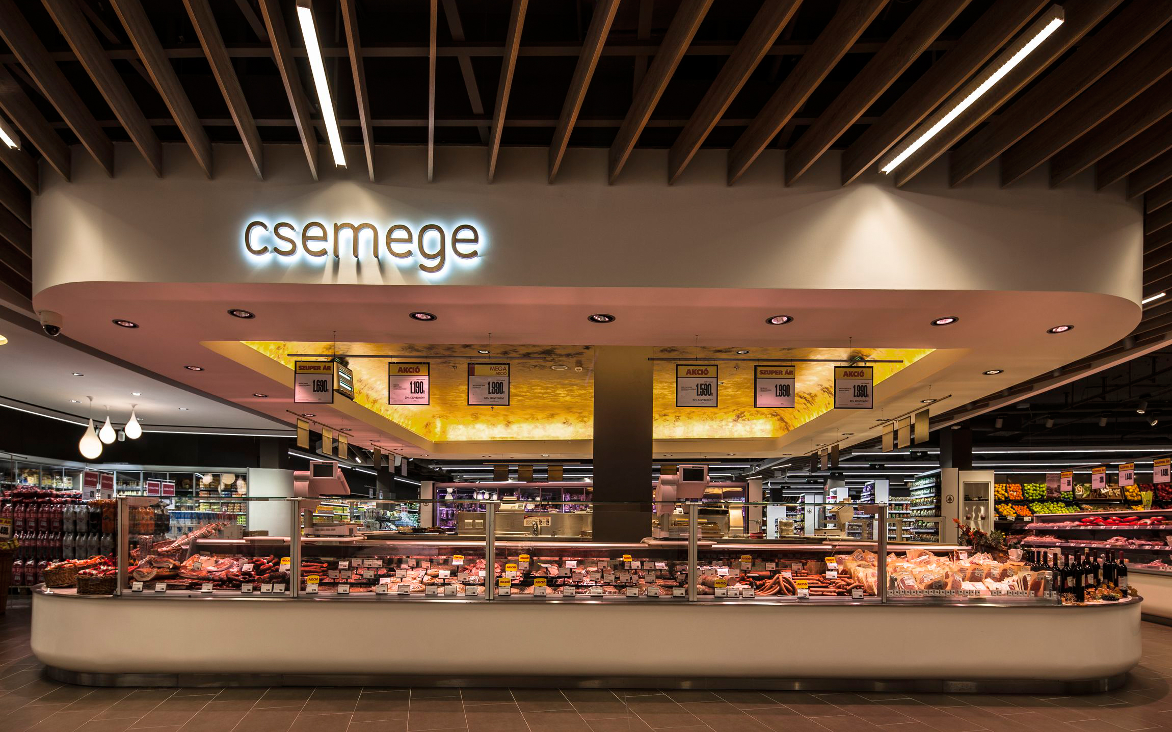
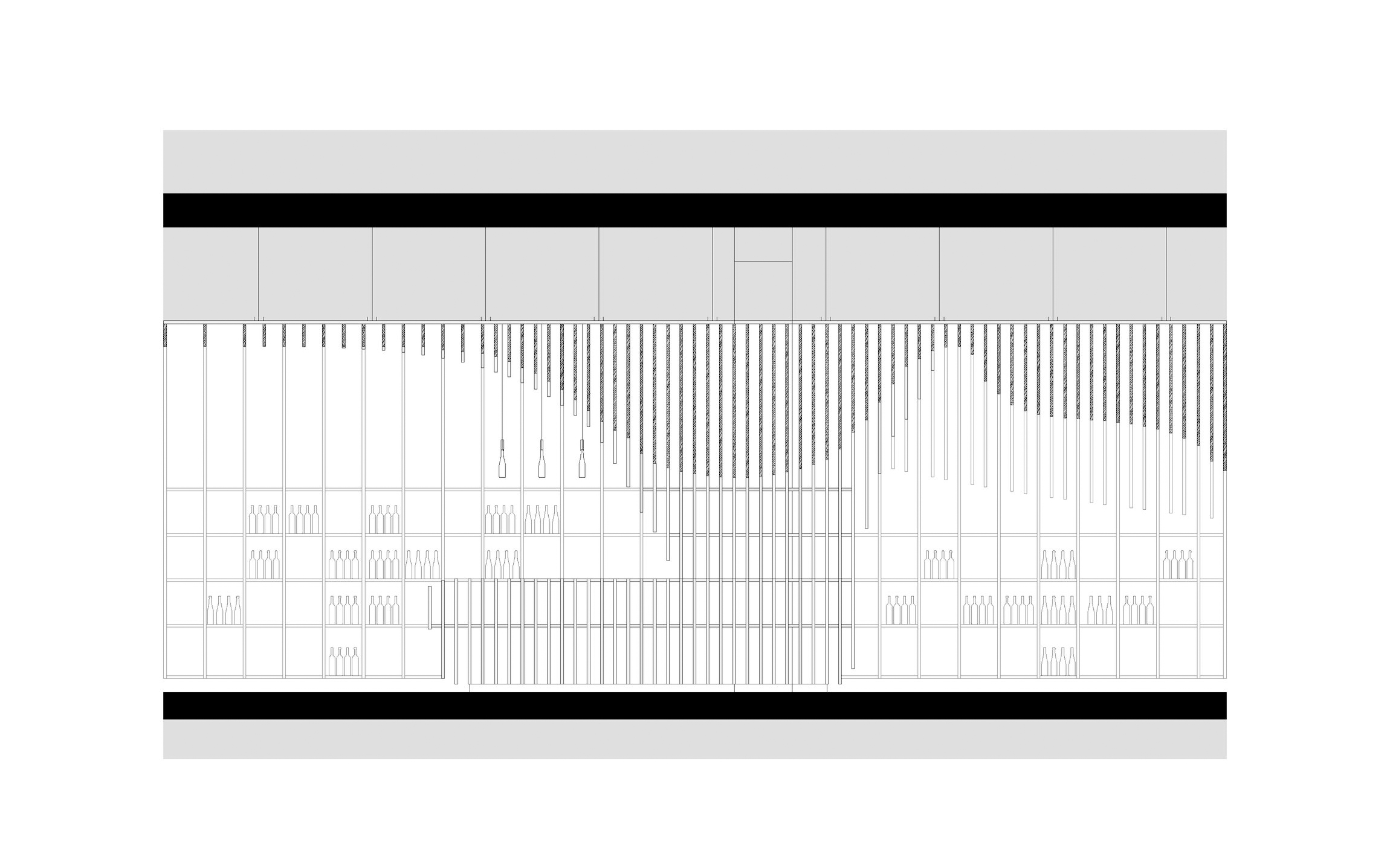
The ceiling is guiding and attracting you from the entrance to the back zone, and then shows different alternative ways to go on. The block before cashiers is more like a traditionally organised supermarket, so it doesn't have suspended ceiling, and the layout is based on a regular grid. Due to the condition of the modest internal height, we wanted to gain the space above the suspended ceiling zone, so we didn't put a ceiling, unless it was really necessary, and where we put it, it was used in a free-form way, for being presented as an individual, expanded statuesque object. Where we could we used solid white surface, and where we had to put additional elements (lights, sprinkler, etc.) we used optical ceiling.
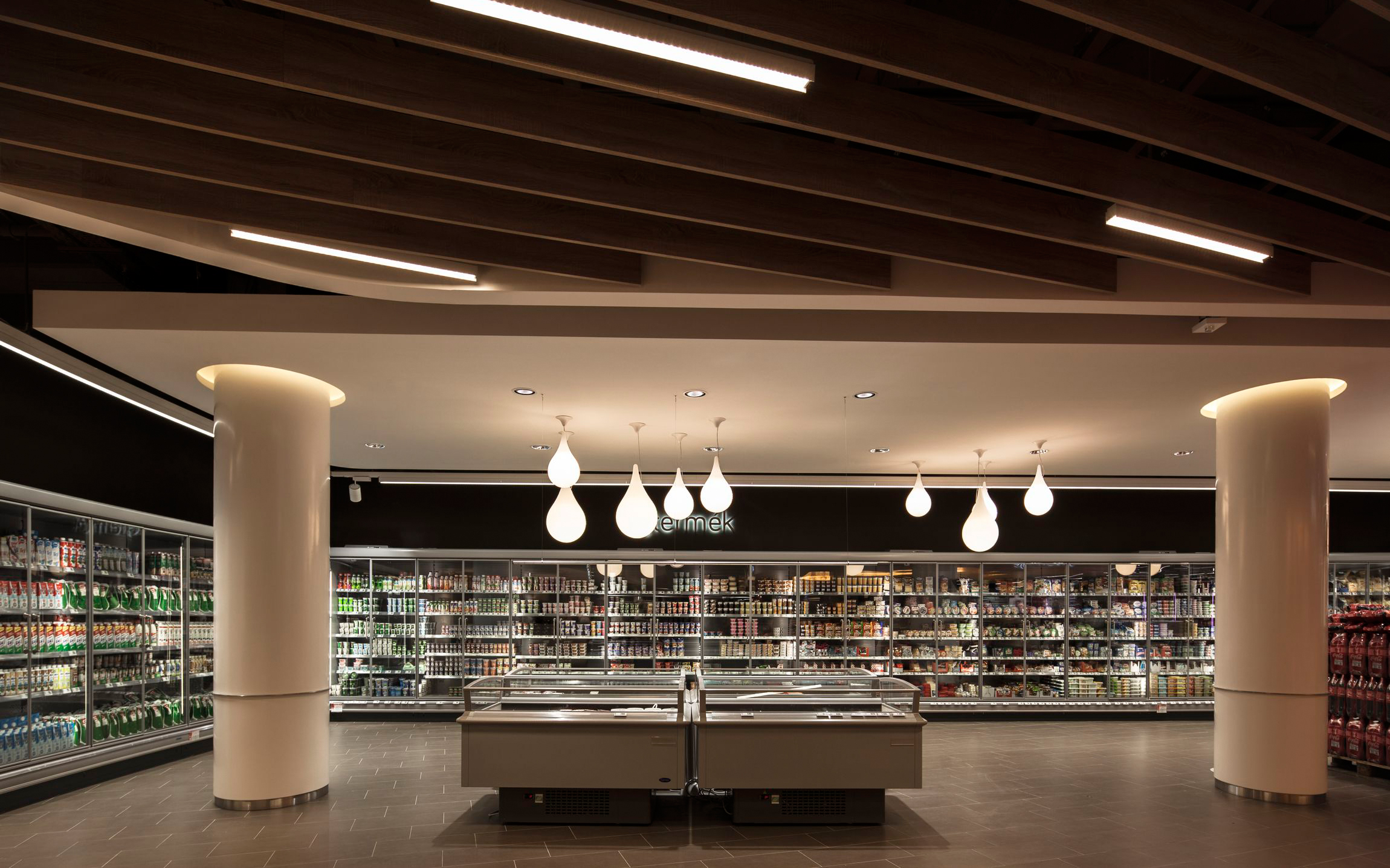
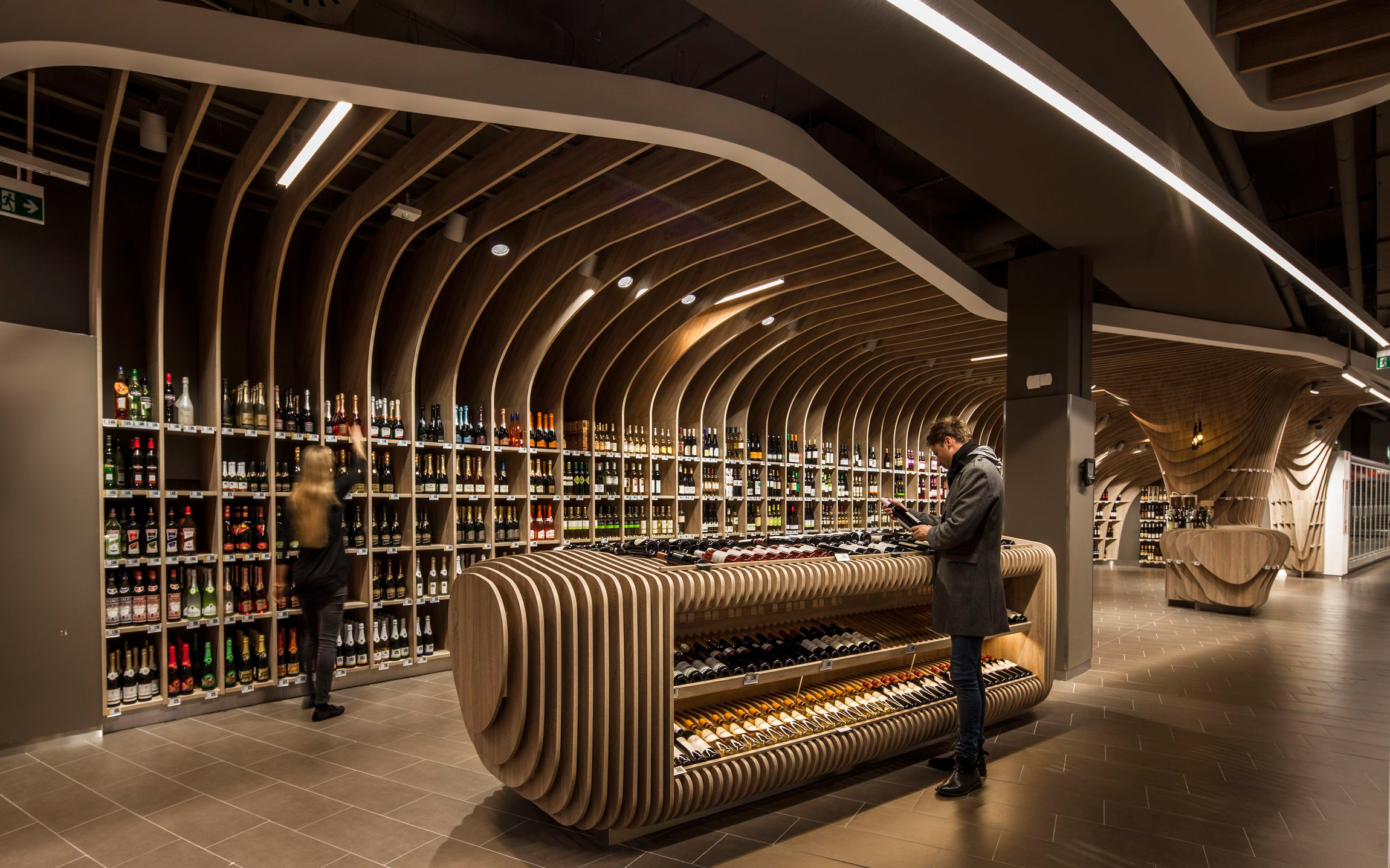
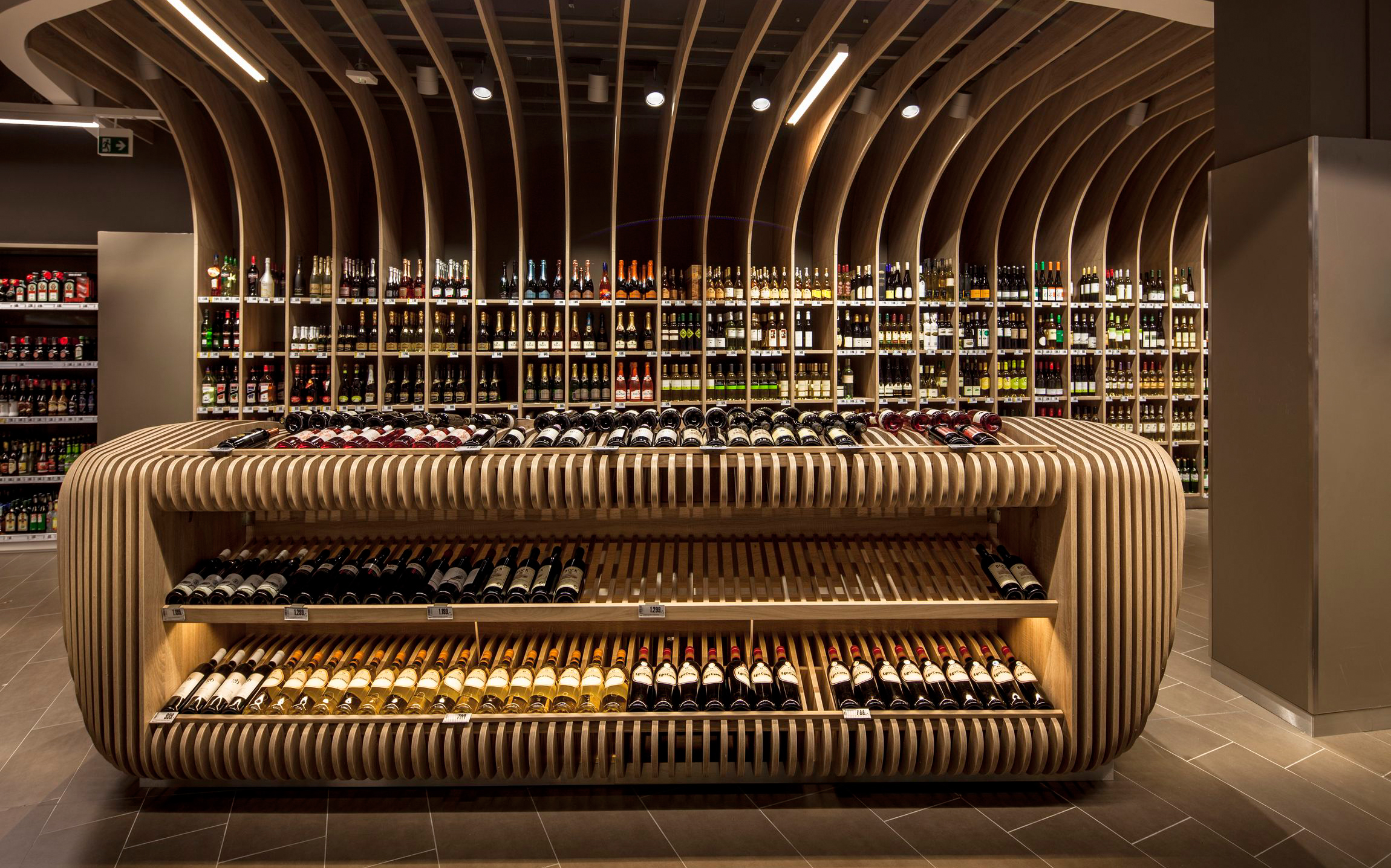
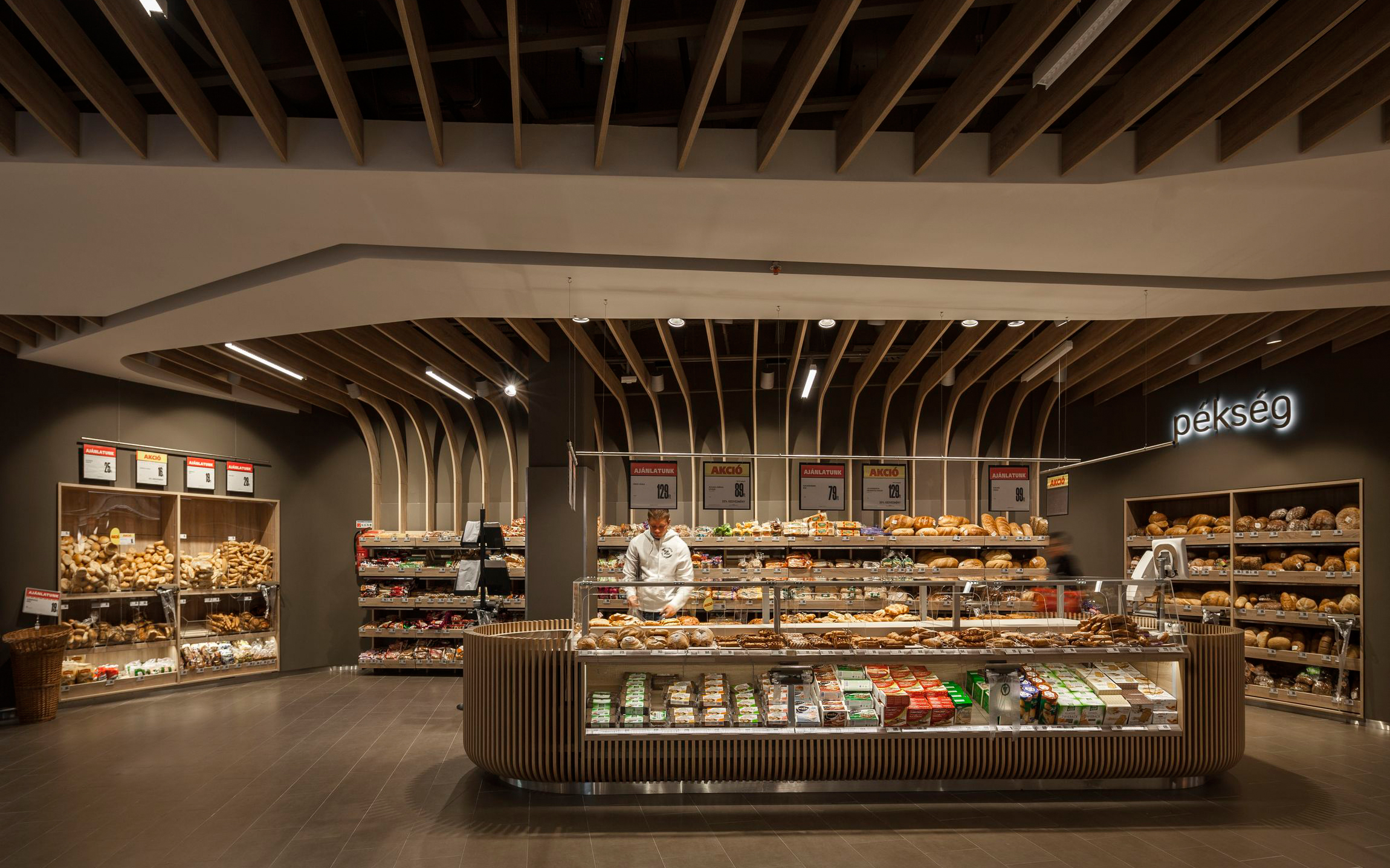
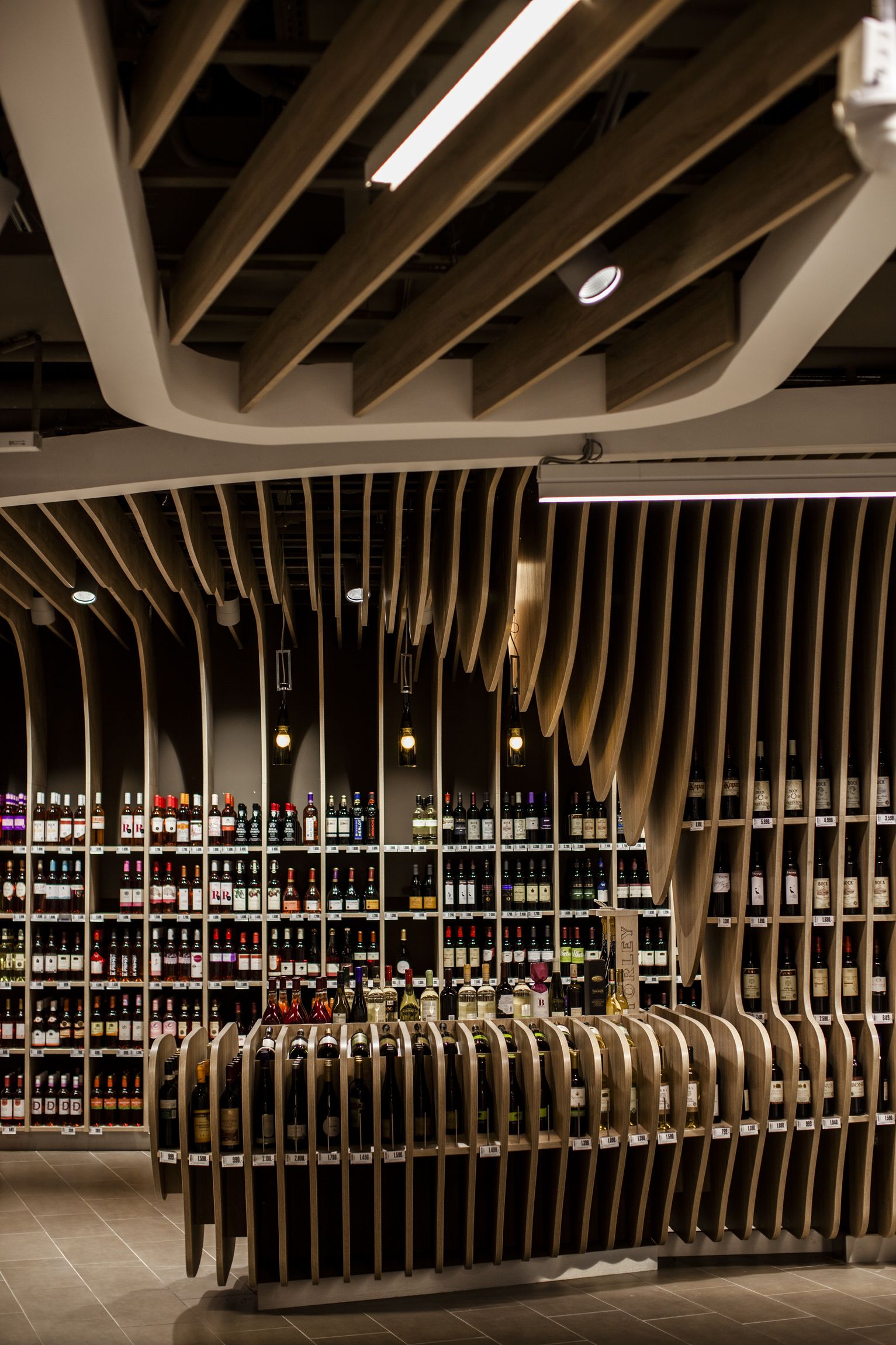
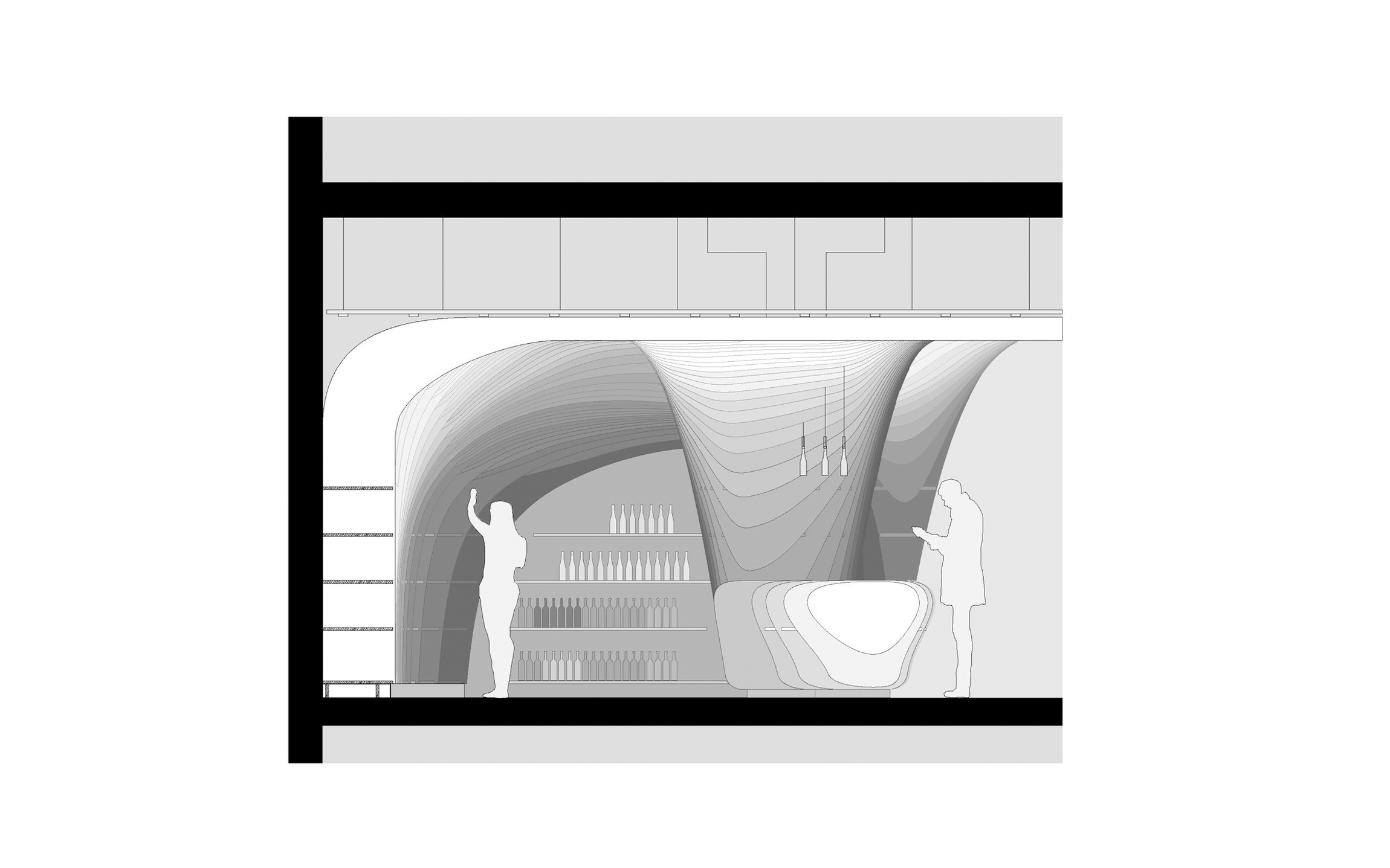
Because of different use, there are two zones where the optical part of the ceiling converts into a 3d form by flowing down to the ground. At the bakery products warm feelings are strengthen. At the wine section, the lamellas of the ceiling are continuing down to the ground to form a space of a cellar, and to indicate at this point the quality and the culture of the product.
Generally saying, as the ceiling is the element that can be seen from everywhere, it became one of the main elements of orientation and impression.
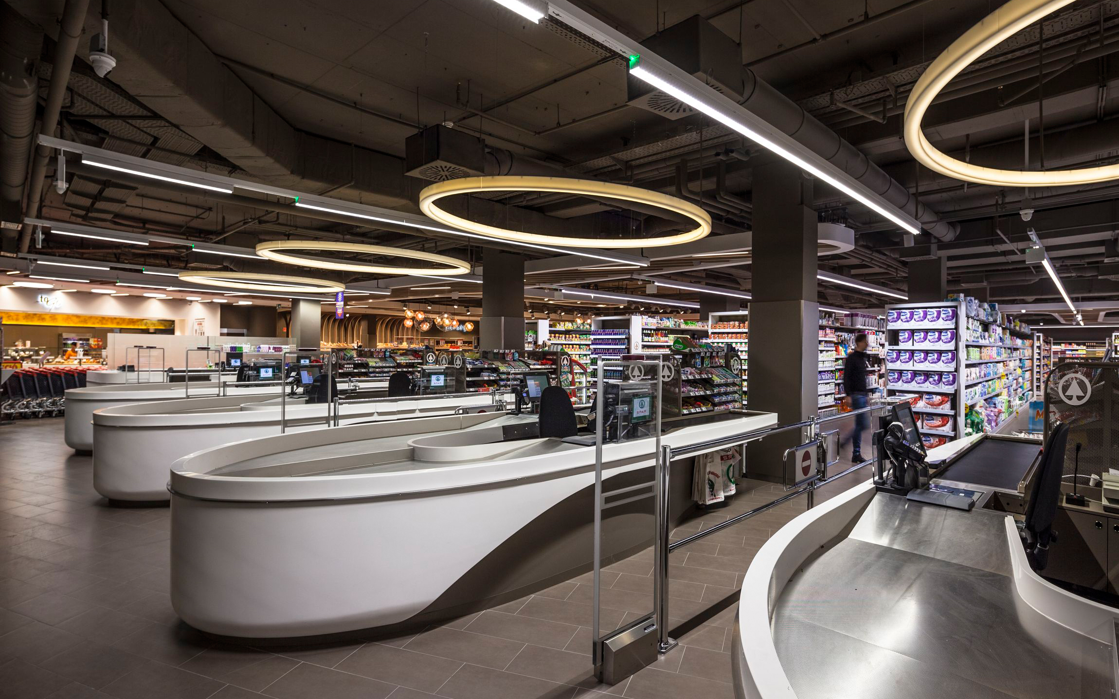
Shelves and counters are forming rounded islands together, just as if they were standing at a market.
Materials and colours
The Dutch word "Spar" meaning pinewood gave the idea of using "wood-like" materials at the ceiling or at the winery. It also helps to create a cosier atmosphere in spite of the emphasized industrial look of the majority of the elements.
Acryl (corian) was chosen for the finishing of all rounded furniture, as they had to be white, shiny, clean, durable, and supporting the "fluid" effect.
Due to many contradictory specifications we couldn't apply concrete for the floor as we planned, but the single colour solution of grey tiling is perfect for the goal.
Maybe because of the fact that we are architects and not interior designers originally, we were seeing this retail as being one part of the big shopping mall, so we used the colour brown of its public spaces, on many elements (floor, ceiling, rear of shelves, etc.), and no other colours (beside grey and white).
Publications:
Dezeen https://www.dezeen.com/2013/12/24/spar-supermarket-displays-groceries-between-curved-wooden-ribs/
Archdaily http://www.archdaily.com/463327/spar-flagshipstore-lab5-architects